A Practical Guide to Creating Professional Print-Ready Maps

Kirill Shrayber – professional cartographer with more than 25 years of experience in vector and thematic cartography.
Doctor of Technical Sciences, Member of the American Geographical Society.
About the Author
Kirill Shrayber is a professional cartographer with more than 25 years of experience in vector and thematic cartography.
Doctor of Technical Sciences.
Member of the American Geographical Society.
Over 4,000 vector maps have been created under his direction — from detailed city plans to national and world-scale cartographic systems.
Areas of expertise include:
-
Large-format print cartography
-
Vector map production workflows
-
GIS data processing and topology cleaning
-
Cartographic projections
-
High-detail commercial map publishing
This section of the website is not theory.
It is a structured production methodology based on real commercial map projects.
Download PDF version of this book – english >>>
Why Professional Vector Maps Still Matter
Modern users are привык к online maps — Google Maps, web tiles, navigation apps.
But what you see on a screen is not a “map” in the classical sense.
It is a tile service — a dynamic rendering controlled by an algorithm.
You do not control:
-
line thickness
-
layer hierarchy
-
generalization level
-
projection choice
-
typography
-
visual emphasis
Professional vector cartography gives you full control.
And control is everything.
What Is a Vector Map?
A vector map is a mathematical model of territory.
It consists of:
-
Points (POI, markers)
-
Lines (roads, rivers, boundaries)
-
Polygons (buildings, land use, water bodies)
-
Attributes (names, classifications, metadata)
-
A coordinate reference system (CRS)
Unlike raster images, vector maps:
-
Scale without quality loss
-
Allow object-level editing
-
Preserve topology
-
Can be optimized for print
-
Support professional cartographic design
A vector map is not an image.
It is structured geographic data.
🔷 Key Terms in Vector Cartography
Glossary of Professional Map Production
Vector Map
A mathematical representation of geographic space built from points, lines and polygons. Unlike raster images, vector maps scale without quality loss and are suitable for professional print production.
Raster Map
A pixel-based image composed of tiles or bitmap layers. Raster maps lose clarity when enlarged and are not ideal for large-format printing.
Shapefile (SHP)
A classical GIS format used to store vector geometry and attribute data. Consists of multiple related files (.shp, .shx, .dbf, .prj).
GeoJSON
A text-based geographic data format commonly used in web mapping applications.
Coordinate Reference System (CRS)
A mathematical framework that defines how geographic coordinates are projected onto a flat surface. All layers in a map project must share the same CRS.
Map Projection
A mathematical transformation that converts spherical Earth coordinates into a flat map. Every projection introduces distortion.
Topology
The structural correctness of spatial relationships between geographic objects. Includes connectivity, closed polygons and absence of overlaps.
Street Network Graph
A representation of roads as edges and intersections as nodes. Essential for maintaining structural clarity in urban maps.
Map Generalization
Controlled simplification of geographic data to match scale and improve readability in print.
Layer Hierarchy
The visual stacking order of map elements, determining readability and emphasis.
Stroke Weight Hierarchy
The structured variation of line thickness used to communicate importance of roads and boundaries.
Vector PDF
A print-ready format that preserves scalable vector geometry without rasterization.
Print-Ready Map
A finalized vector map optimized for large-format printing, with correct hierarchy, color mode and outlined text.
Table of contents
- Chapter 1 — What Is a Vector Map?
- Chapter 2 — Obtaining and Preparing Geodata (SHP, OSM, GeoJSON)
- Chapter 3 — Street Network as a Graph (Nodes and Edges Explained)
- Chapter 4 — Cartographic Layer Hierarchy and Visual Structure
- Chapter 5 — Map Projections and Why Distortion Is Inevitable
- Chapter 6 — Map Generalization and Scale Control
- Chapter 7 — Vector Formats: SHP, GeoJSON, AI and PDF
- Chapter 8 — Professional Map Production Workflow
- Chapter 9 — Preparing a Vector Map for Print in Illustrator
- Chapter 10 — Common Mistakes in Vector Map Production
Chapter 1 — What Is a Vector Map?
Vector vs Raster Maps Explained for Print Cartography
Modern users think they understand maps.
They use Google Maps.
They zoom.
They search.
They navigate.
But what they see is not a map in the classical cartographic sense.
It is a tile service.
If you want to create professional print maps, you must understand the difference.
What Is a Vector Map?
A vector map is a mathematical representation of geographic space.
It is built from:
-
Points — locations (POI, markers, landmarks)
-
Lines — roads, rivers, railways, boundaries
-
Polygons — buildings, land use areas, lakes, administrative zones
-
Attributes — names, classifications, metadata
-
Coordinate Reference System (CRS) — the spatial framework
A vector map is not an image.
It is structured geographic data.
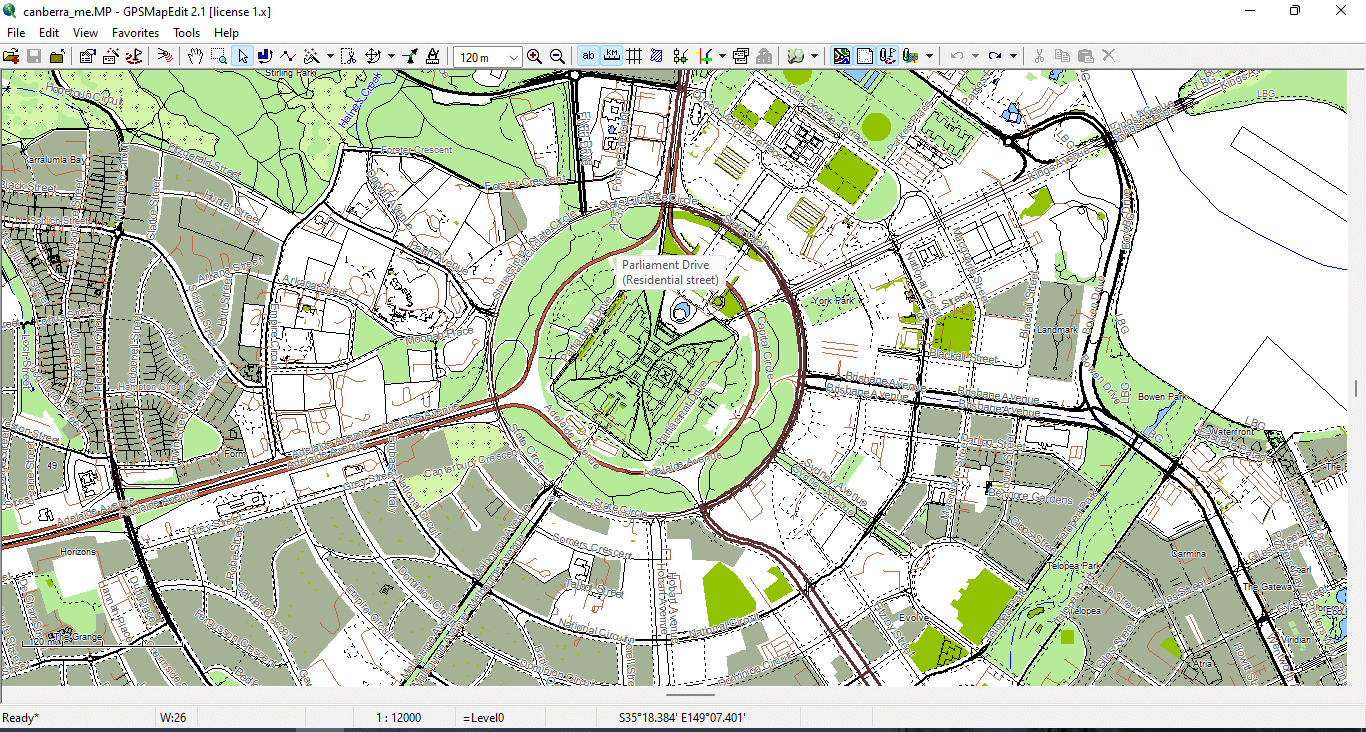
Figure 1. Basic Vector Geometry Types: Points, Lines, and Polygons.
How Online Maps Actually Work
Most web maps (Google, Bing, many others) use:
-
256×256 pixel raster tiles
-
Dynamic zoom levels
-
Predefined styling
-
Server-side generalization
You do not control:
-
line thickness
-
visual hierarchy
-
projection
-
simplification level
-
typography
-
layer stacking
The rendering logic belongs to the provider.
For navigation, this is fine.
For professional cartography — it is not.
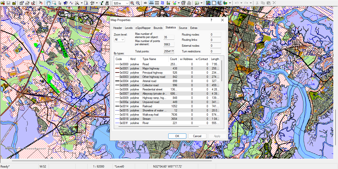
Figure 2. Example of Road Layer Attribute Table in GIS.
Vector Map vs Raster Map
Raster Map
-
Built from pixels
-
Fixed resolution
-
Loses quality when scaled
-
Hard to edit object-by-object
-
Often exported as JPG or PNG
Vector Map
-
Built from coordinates
-
Infinite scaling without quality loss
-
Editable at object level
-
Supports topology
-
Ideal for large-format printing
-
Exportable to AI and vector PDF
If you enlarge a raster image, it becomes blurry.
If you enlarge a vector map, it becomes sharper.
That is the fundamental difference.
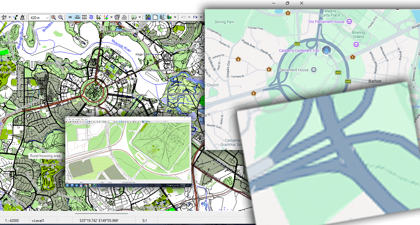
Figure 3. Vector vs Raster Data Structure Comparison.
Why Vector Maps Are Essential for Print
Large wall maps require:
-
Precise line hierarchy
-
Correct stroke weights
-
Clean typography
-
Controlled generalization
-
Stable file size
-
High-resolution export
Raster maps cannot handle that properly.
Vector geometry allows:
-
1-meter precision
-
Smooth curves
-
Optimized coastline simplification
-
Controlled detail density
-
Professional print workflows
If you plan to produce large-format maps, vector is not optional.
It is mandatory.
Core Components of Vector Geometry
1. Points
Used for:
-
Landmarks
-
POI
-
Control nodes
-
Labels
Points can carry attributes such as:
-
Name
-
Category
-
ID
2. Lines (LineString)
Used for:
-
Roads
-
Rivers
-
Railways
-
Borders
Lines consist of vertices (nodes).
Too many vertices make the file heavy.
Too few destroy shape accuracy.
Balancing this is called generalization (covered in Chapter 6).
3. Polygons
Used for:
-
Buildings
-
Lakes
-
Parks
-
Administrative boundaries
-
Land use zones
Polygons must be topologically correct:
-
Closed
-
Non-self-intersecting
-
Free of micro-gaps
Otherwise printing and export problems appear.
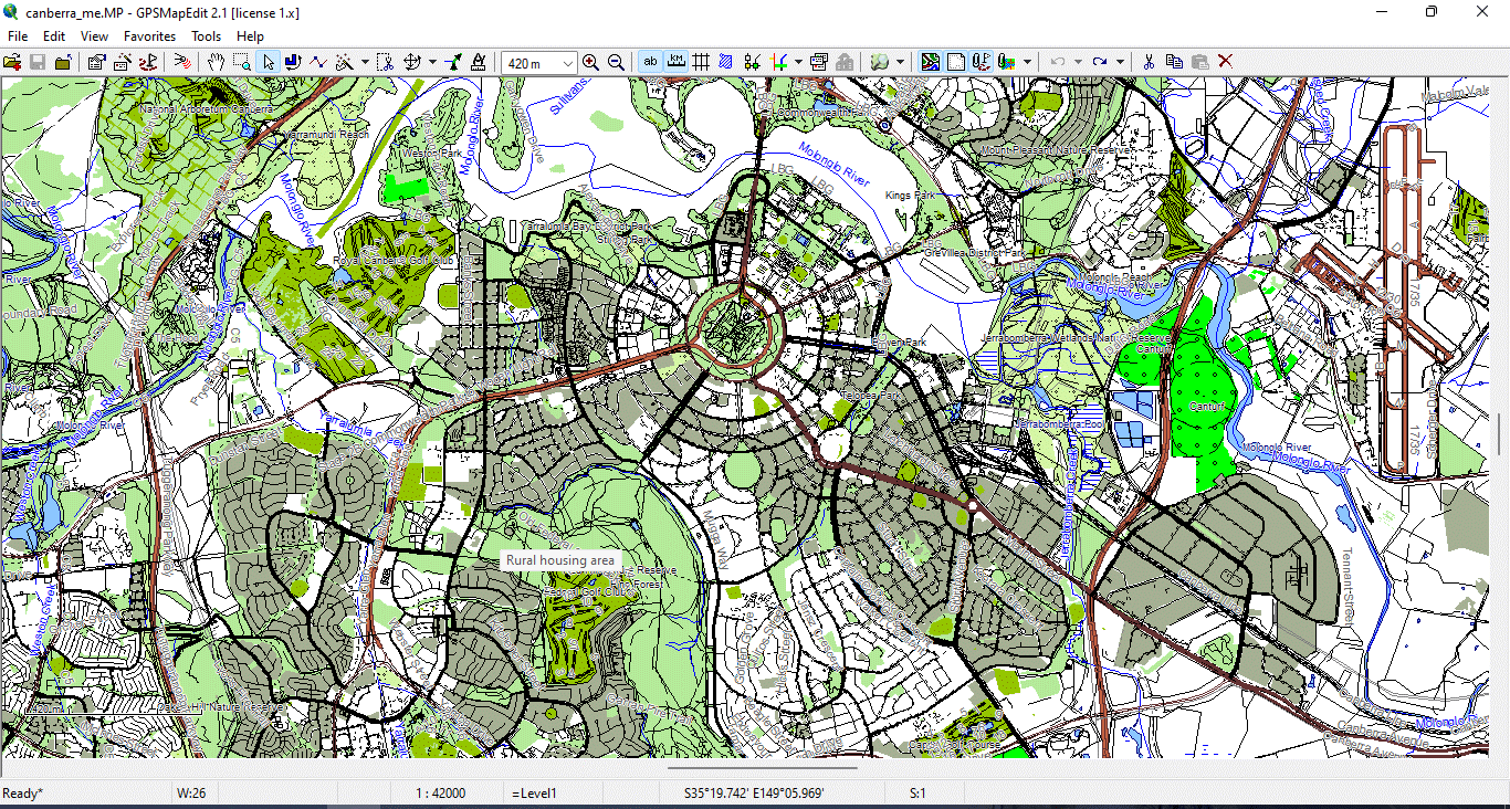
Figure 4. Vector layers geometry types 2.
What Is CRS (Coordinate Reference System)?
Every vector dataset must have a coordinate system.
Common systems include:
-
WGS84
-
Web Mercator
-
Local projected systems
If you mix coordinate systems in one project, geometry shifts occur.
Before starting production:
Always verify CRS alignment.
Figure 5. Vector layers geometry types 3.
Why Beginners Get Confused
Many beginners think:
“Google Maps looks fine — I can just export it.”
You cannot.
Web maps:
-
Are copyrighted
-
Are raster-based
-
Are not optimized for print
-
Cannot provide full vector geometry
-
Cannot be fully controlled
Professional cartography requires raw geodata.
A Simple Test
Open a JPG map.
Zoom to 800%.
It becomes blurry.
Now open a vector PDF.
Zoom to 800%.
Lines remain sharp.
That difference is why vector maps dominate professional map publishing.
Summary
A vector map is:
-
Mathematical
-
Scalable
-
Editable
-
Structured
-
Suitable for print
Raster maps are images.
Vector maps are geographic data systems.
If you want to build professional maps, you must work in vector format from the very beginning.
Next Step
Now that you understand what a vector map is,
the next step is learning how to obtain and prepare professional geodata.
Frequently Asked Questions
What is the difference between a vector map and a raster map?
A vector map is built from geographic coordinates (points, lines, polygons) and scales without quality loss. A raster map is pixel-based and loses clarity when enlarged.
Why can’t I use Google Maps for print production?
Google Maps uses raster tiles and proprietary rendering. It does not provide full editable vector geometry suitable for professional print workflows.
Are vector maps better for large wall maps?
Yes. Vector maps maintain sharp lines and readable typography at any scale, making them ideal for large-format printing.
What software is required for vector map production?
Typically GIS software for data processing and Adobe Illustrator for final design and print preparation.
Chapter 2 — Obtaining and Preparing Geodata (SHP, OSM, GeoJSON)
Obtaining and Preparing Geodata
SHP, OSM, GeoJSON and the First Critical Steps in Map Production
If Chapter 1 explained what a vector map is,
this chapter explains where the real work begins.
Professional map production does not start in Illustrator.
It starts with raw geodata.
And raw geodata is almost never clean.
Where to Get Vector Geodata
There are many sources of geographic data. The key is knowing which to trust — and how to combine them.
1. OpenStreetMap (OSM)
One of the most widely used global datasets.
Advantages:
-
Global coverage
-
Frequent updates
-
Free and open
Limitations:
-
Inconsistent quality across regions
-
Community-maintained (not always standardized)
-
Often overloaded with unnecessary attributes
You can extract data via:
-
Direct regional downloads
-
Overpass API
-
Pre-packaged extracts (Geofabrik, etc.)
Figure 1. Where to Get Vector Geodata.
2. Government Open Data Portals
For many countries, official data is more reliable than OSM.
Typical datasets:
-
Road networks
-
Administrative boundaries
-
Postal codes
-
Land parcels
-
Building footprints
Government data is often:
-
More standardized
-
Better classified
-
Topologically cleaner
But:
-
Licensing must always be checked.
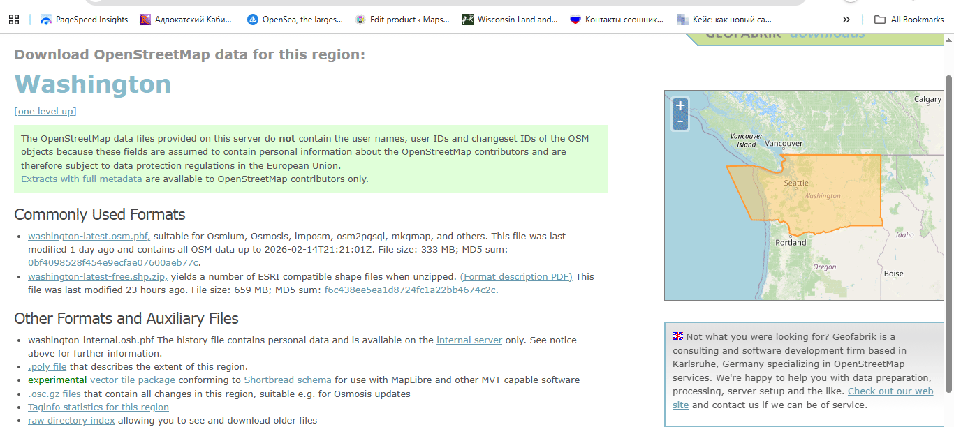
Figure 2. Where to Get Vector Geodata 2.
3. Commercial Data Providers
In some projects (especially infrastructure or logistics),
commercial datasets may be necessary.
They are:
-
Structured
-
Professionally maintained
-
Often expensive
Use them when precision matters.
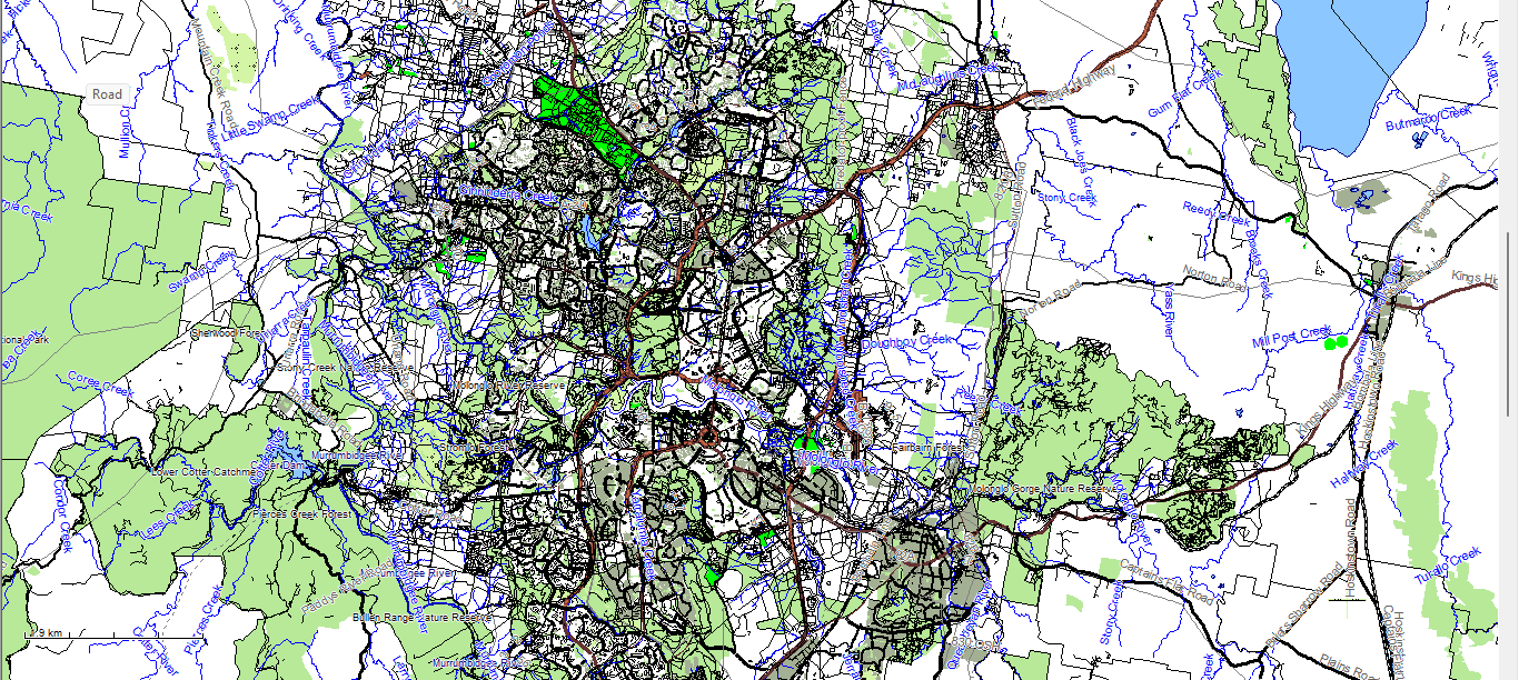
Figure 3. Where to Get Vector Geodata 3 – raw downloaded geodata in MapEdit.
Never Use Only One Source
This is a critical rule.
Different sources contain different strengths:
-
OSM → good street detail
-
Government datasets → accurate boundaries
-
Satellite imagery → reality check
-
Local municipal data → high precision
Professional production often requires merging multiple sources into one coherent structure.
Common Geodata Formats
Before cleaning, you must understand the format you are importing.
Shapefile (SHP)
A classical GIS format consisting of multiple files:
-
.shp— geometry -
.shx— geometry index -
.dbf— attribute table -
.prj— projection -
sometimes
.cpg,.qix, etc.
Important:
Shapefile is not a single file.
It is a structured dataset.
Advantages:
-
Industry standard
-
Widely supported
-
Stable for production workflows
Limitations:
-
Attribute name length restrictions
-
No complex topology support
-
Multiple-file structure
GeoJSON
A text-based format.
Advantages:
-
Single file
-
Human-readable
-
Ideal for web usage
Limitations:
-
Large file sizes
-
Not optimized for heavy production
-
No indexing
GeoJSON is excellent for web mapping.
For large production maps, it is usually an intermediate format.
Step 1: Verify the Coordinate Reference System (CRS)
Before doing anything else:
Check the CRS.
Common coordinate systems:
-
WGS84
-
Web Mercator
-
Local projected systems
If you combine datasets with different CRS without reprojecting them properly:
-
Roads shift
-
Boundaries misalign
-
Buildings float
-
Printing becomes impossible
Golden rule:
Never work in mixed projections.
Always align CRS at the beginning.
Step 2: Inspect Raw Data Quality
Raw datasets almost always contain problems.
Typical issues:
-
Duplicate geometries
-
Broken line segments
-
Micro-gaps in polygons
-
Overlapping boundaries
-
Incorrect classifications
-
Excessive attributes
-
Redundant POI points
Before design begins, the dataset must be cleaned.
Step 3: Remove What You Do Not Need
One of the biggest beginner mistakes:
Keeping everything.
For a print city map, you usually do NOT need:
-
Every POI
-
Service driveways
-
Temporary objects
-
Internal parcel divisions
-
Minor footpaths (depending on scale)
Overloaded data produces:
-
Heavy files
-
Slow processing
-
Visual chaos
Cartography is selective.
Remove noise early.
Step 4: Clean and Standardize Attributes
Attribute tables often contain:
-
Inconsistent naming
-
Mixed language labels
-
Empty fields
-
Redundant columns
For example:
One dataset may use:
-
highway = primary
Another:
-
road_type = major
Standardize classifications early.
Otherwise your layer hierarchy later becomes unmanageable.
Step 5: Correct Street Network Structure
Even before formal topology cleaning, inspect:
-
Broken road connections
-
Misaligned intersections
-
Duplicated line segments
-
Incorrect direction flags
The street network is the structural backbone of most city maps.
If the graph is broken, everything built on top will be unstable.
We will cover full graph logic in Chapter 3.
Step 6: Save Clean Intermediate Versions
Professional workflow always includes version control.
Example structure:
city_clean_v2.shp
city_standardized_v3.shp
city_generalized_v4.shp
Never overwrite the original dataset.
You may need to return to it later.
Common Beginner Mistakes in Data Preparation
-
Mixing coordinate systems
-
Editing without saving versions
-
Ignoring attribute cleanup
-
Trusting one data source
-
Importing directly into Illustrator without GIS cleaning
Illustrator is not a GIS cleaning tool.
Data must be prepared before design begins.
What Clean Geodata Should Look Like
Before moving to the next stage, your dataset should:
-
Have a unified CRS
-
Contain only relevant object types
-
Have standardized classifications
-
Be free from obvious duplicates
-
Be topologically consistent
-
Have manageable file size
If this stage is done correctly,
the rest of the workflow becomes stable.
If not — you will suffer later.
Summary
Obtaining geodata is easy.
Preparing geodata is professional work.
Professional vector map production begins with:
-
Careful source selection
-
CRS alignment
-
Data cleaning
-
Attribute standardization
-
Structural validation
Only after this foundation is solid
can real cartographic design begin.
Next Chapter
Now that the data is clean,
we move to the structural backbone of every city map:
Frequently Asked Questions
Where can I download shapefiles (SHP)?
Shapefiles are available from OpenStreetMap extracts, government open data portals, and commercial geodata providers.
What is CRS in GIS?
CRS (Coordinate Reference System) defines how geographic coordinates are mapped onto a flat surface. All layers must share the same CRS.
Can I skip data cleaning before design?
No. Raw geodata contains structural errors and unnecessary attributes that must be cleaned before production.
Is GeoJSON suitable for large print maps?
GeoJSON is ideal for web applications but usually not optimal for heavy large-format print production.
Chapter 3 — Street Network as a Graph (Nodes and Edges Explained)
Street Network as a Graph
Nodes, Edges and Why Road Topology Determines Map Quality
If geodata preparation is the foundation,
the street network is the structural skeleton.
Remove buildings.
Remove land use.
Remove labels.
What remains?
The road graph.
And that graph defines how the city works.
What Is a Street Network Graph?
In mathematical terms, a graph consists of:
-
Nodes — connection points
-
Edges — connecting segments
In cartography:
-
Node = intersection
-
Edge = road segment between intersections
This is not theory for academics.
If your road graph is wrong, your map will be wrong.
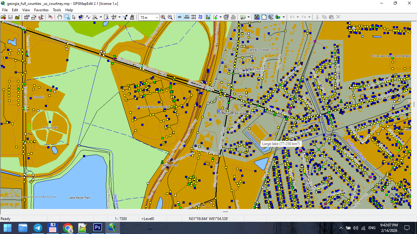
Figure 1. Street Network Nodes at Road Intersections.
Why Graph Structure Matters in Print Maps
Broken topology leads to:
-
Visual gaps
-
Misaligned intersections
-
Duplicate strokes
-
Confusing overlaps
-
Incorrect road hierarchy
Even if the map looks “fine” at first glance,
errors appear during:
-
Generalization
-
Stroke hierarchy styling
-
Illustrator export
-
Large-format printing
Road topology is not decoration.
It is infrastructure.
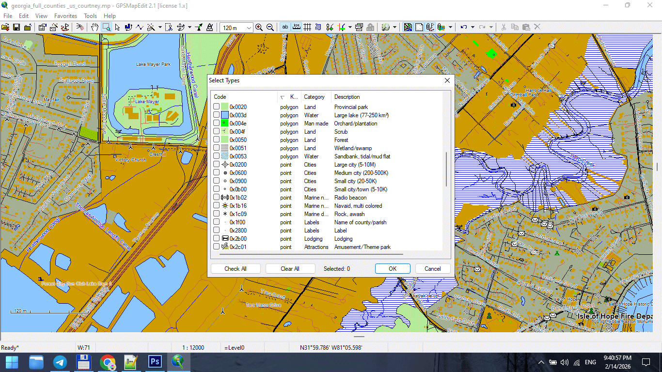
Figure 2. Road Segments (Edges) and Direction Attributes.
Common Street Network Problems
Raw datasets often contain:
1. Broken Intersections
Two roads visually cross
but are not actually connected in geometry.
This causes:
-
Direction inconsistencies
-
Gaps during styling
-
Incorrect hierarchy rendering
2. Duplicate Segments
Same road stored twice.
Results:
-
Double-thick strokes
-
Export glitches
-
File weight inflation
3. Multi-Segment Chaos
One road broken into dozens of small segments
with inconsistent attributes.
Results:
-
Labeling problems
-
Stroke inconsistency
-
Editing frustration
4. Incorrect Classification
Primary road marked as residential.
Service road marked as trunk.
If classification is wrong:
Layer hierarchy fails.
Road Classification Hierarchy
For most city maps, classification typically follows:
-
Motorway / Highway
-
Primary roads
-
Secondary roads
-
Tertiary roads
-
Residential streets
-
Service roads
-
Footpaths
Do not blindly trust imported classifications.
Verify visually against satellite imagery or reliable reference.
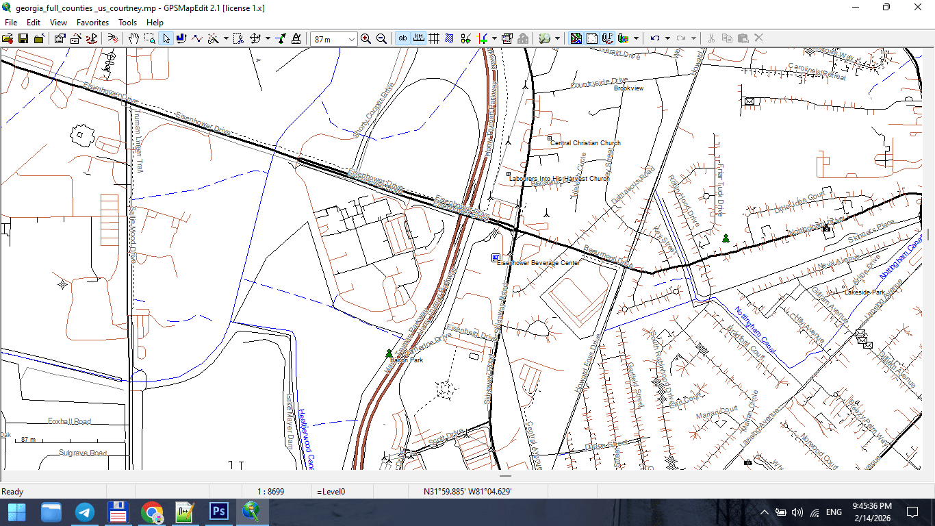
Figure 3. Urban Road Classification Hierarchy.
Nodes and Intersection Logic
In a correct graph:
-
Intersections share a common node
-
Lines meet precisely
-
No micro-gaps exist
-
No overlapping duplicates remain
Micro-gaps may not be visible at normal zoom,
but they break topology.
They also create print artifacts.
Zoom aggressively. Inspect carefully.
Directionality and One-Way Logic
Some datasets store:
-
One-way attributes
-
Direction flags
-
Traffic hierarchy
Even if your print map does not show arrows,
this information helps:
-
Validate road consistency
-
Detect classification errors
-
Identify duplicates
Ignoring attributes entirely is a mistake.
When to Simplify the Graph
Before full generalization (covered in Chapter 6),
basic structural cleanup is necessary:
-
Merge unnecessary segments
-
Standardize classifications
-
Remove irrelevant road types
-
Correct intersections
Do not aggressively simplify yet.
First: fix structure.
Later: reduce geometry.
Graph as the Structural Backbone of the City
Try this thought experiment:
Imagine you strip a city down to just:
-
Roads
-
Bridges
-
Railways
You would still recognize the city.
The street network defines:
-
Density
-
Flow
-
Spatial rhythm
-
Urban character
That is why graph integrity is critical.
Visual Hierarchy Begins Here
Layer hierarchy (Chapter 4) depends on:
Correct classification.
If the graph is structurally wrong,
styling cannot save it.
No color palette can fix broken topology.
Advanced Check: Intersection Density
For advanced beginners:
Examine:
-
Too many tiny segments?
-
Excessive node density?
-
Unnecessary subdivision?
High vertex density:
-
Slows processing
-
Complicates generalization
-
Increases file size
Graph cleanup improves:
-
Performance
-
Stability
-
Print quality
Professional Workflow Rule
Never export raw OSM roads directly into Illustrator.
Always:
-
Inspect graph
-
Correct intersections
-
Standardize classification
-
Remove noise
-
Save cleaned version
Illustrator is for design.
Graph logic belongs in GIS.
What a Clean Street Graph Should Look Like
Before moving forward, your road network should:
-
Have no broken connections
-
Have no duplicate segments
-
Have consistent classification
-
Be logically segmented
-
Have manageable vertex density
-
Be CRS-aligned
If these conditions are met,
you are ready to build cartographic hierarchy.
Summary
A city is a graph.
If the graph is broken:
-
The map is unstable
-
Styling fails
-
Printing suffers
If the graph is clean:
-
Hierarchy becomes logical
-
Generalization becomes controlled
-
Export becomes stable
The road network is not just one layer.
It is the structural backbone of your entire map.
Next Chapter
Now that the structural skeleton is clean,
we can build visual logic on top of it.
Frequently Asked Questions
What is a street network graph?
A street network graph represents roads as edges and intersections as nodes.
Why is topology important in cartography?
Topology ensures correct connections between roads and boundaries. Broken topology causes printing and styling issues.
How do I detect duplicate road segments?
Zoom in, inspect overlapping strokes, and validate attributes in GIS before export.
Should I fix road classification errors?
Yes. Correct classification is essential for proper visual hierarchy.
Chapter 4 — Cartographic Layer Hierarchy and Visual Structure
Cartographic Layer Hierarchy
Why Visual Order Determines Whether a Map Works or Fails
You can have perfect data.
You can have clean topology.
You can have correct projection.
And still produce a bad map.
Why?
Because cartography is not only about data.
It is about visual hierarchy.
Layer order determines readability.
If hierarchy is wrong — the map fails.
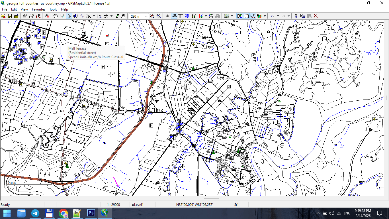
Figure 1. Urban Map Layer Breakdown.
What Is Layer Hierarchy?
Layer hierarchy is the controlled order in which map elements are stacked and visually weighted.
In digital form, this means:
-
Layer stacking order
-
Stroke weight
-
Color contrast
-
Label priority
In print form, it means:
-
What the eye sees first
-
What remains visible at distance
-
What disappears when light is weak
Hierarchy is not decoration.
It is structure.
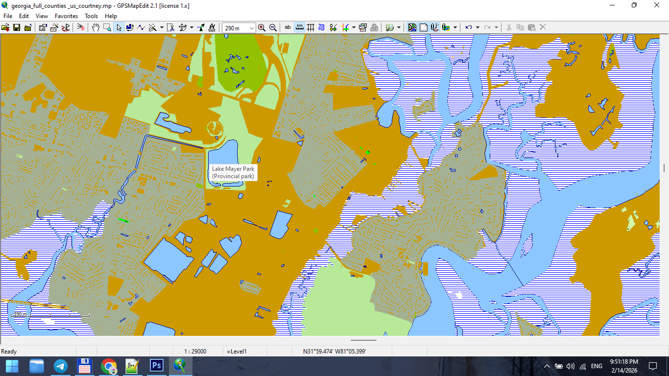
Figure 2. Cartographic Layer Stack from Bottom to Top.
The Rule of Visual Gravity
The human eye moves from:
-
Strong contrast
-
Thick strokes
-
Large text
-
Bright colors
If your hierarchy ignores this,
the map becomes visually chaotic.
Design must guide the eye.
Typical Layer Order for a City Map
From top to bottom:
1. Major Labels
-
City names
-
District names
-
Important landmarks
Text must sit above everything.
2. Road Names
-
Motorways
-
Primary streets
Typography must remain readable at 100% print scale.
3. Major Roads
-
Highways
-
Primary roads
Usually thicker strokes and stronger color contrast.
4. Secondary Roads
-
Secondary streets
-
Tertiary streets
Reduced stroke weight.
5. Minor Streets
-
Residential roads
-
Service roads
Light stroke weight. Lower visual dominance.
6. Railways
Usually below major roads but above buildings.
7. Buildings
Typically subtle fill color.
Buildings must support structure — not dominate it.
8. Water Bodies
Lakes, rivers, canals.
Water provides spatial orientation.
9. Land Use / Parks
Very light background colors.
Should never overpower roads.
10. Background
Neutral tone.
Background is critical.
If too bright → roads disappear.
If too dark → labels lose contrast.
Figure 3. Final Map Composition After Layer Stacking.
Stroke Weight Hierarchy
Stroke weight communicates importance.
Example:
-
Motorway: 1.2 pt
-
Primary road: 0.9 pt
-
Secondary road: 0.6 pt
-
Residential: 0.3 pt
Exact values depend on scale.
But relative hierarchy must be consistent.
If residential roads are thicker than primary roads,
your visual logic collapses.
Typography Is Not Decoration
Typography must:
-
Be readable at print scale
-
Avoid collisions
-
Follow street curvature correctly
-
Maintain consistent font hierarchy
Avoid:
-
Too many font styles
-
Overlapping labels
-
Excessive curvature
-
Random rotation
The map reader must never struggle to read.
Readability Test
Print a fragment at 100%.
Place it on a wall.
Step back 2–3 meters.
Ask yourself:
-
Are major roads immediately visible?
-
Are labels readable?
-
Is spatial structure clear?
If not — revise hierarchy.
Screen preview is misleading.
Print reveals truth.
Color Discipline
Color should support structure.
Avoid:
-
Excessive saturation
-
Too many contrasting hues
-
Decorative gradients
Professional maps often use:
-
Limited color palette
-
Controlled contrast
-
Functional differentiation
Color is hierarchy — not decoration.
Common Hierarchy Mistakes
-
Too many layers competing for attention
-
Parks brighter than roads
-
Buildings darker than highways
-
Labels hidden below strokes
-
No clear contrast between primary and secondary roads
Hierarchy must be intentional.
Layer Management in Practice
In complex projects, 40–60 layers are normal.
Professional layer naming:
-
roads_primary
-
roads_secondary
-
labels_major
-
buildings_fill
-
water_polygons
Clear naming prevents chaos.
Chaos in layers → chaos in output.
Hierarchy Before Style
Never start with colors.
First define:
-
Structural order
-
Stroke hierarchy
-
Text hierarchy
Then apply color.
Otherwise you decorate without structure.
Summary
Layer hierarchy is the visual logic of your map.
Correct hierarchy makes:
-
Complex cities readable
-
Dense data understandable
-
Print stable
-
Design clean
Incorrect hierarchy makes:
-
Data noisy
-
Roads confusing
-
Labels unreadable
-
Map unusable
Cartography is structured clarity.
Hierarchy is its backbone.
Next Chapter
Now that visual structure is established,
we must address one of the most misunderstood topics:
Frequently Asked Questions
What is layer hierarchy in cartography?
Layer hierarchy is the structured visual order of map elements, controlling readability and importance.
Why do major roads need thicker strokes?
Stroke weight visually communicates importance and supports spatial navigation.
How many layers should a professional city map have?
Complex maps often contain 40–60 structured layers.
Does color matter for hierarchy?
Yes. Color must support structure, not compete with it.
Chapter 5 — Map Projections and Why Distortion Is Inevitable
Map Projections
Why Every Map Distorts Reality — and Why That Is Normal
A map is not reality.
It is a transformation.
The Earth is a sphere (more precisely, an oblate spheroid).
A map is flat.
To transfer curved space onto a plane, distortion is unavoidable.
There is no “perfect” projection.
There is only a projection appropriate for your task.
What Is a Map Projection?
A map projection is a mathematical method of converting geographic coordinates (latitude and longitude) into flat, two-dimensional coordinates.
Every projection transforms:
-
Shape
-
Area
-
Distance
-
Direction
You cannot preserve all four simultaneously.
You must choose what matters.
The Four Types of Distortion
Understanding distortion is critical for professional cartography.
1. Shape Distortion
Objects may become stretched or compressed.
Example:
Greenland appears much larger in Mercator projection than it actually is.
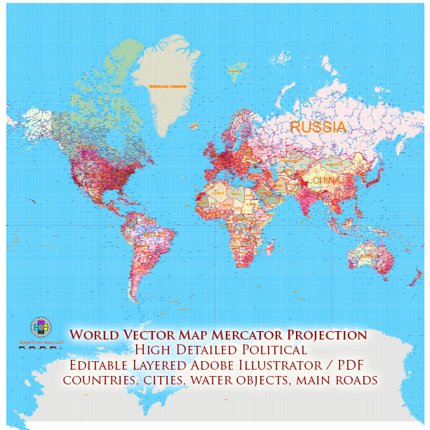
Figure 1. Mercator Projection Example.
2. Area Distortion
Some projections preserve shape but distort size.
Equal-area projections preserve true size relationships.
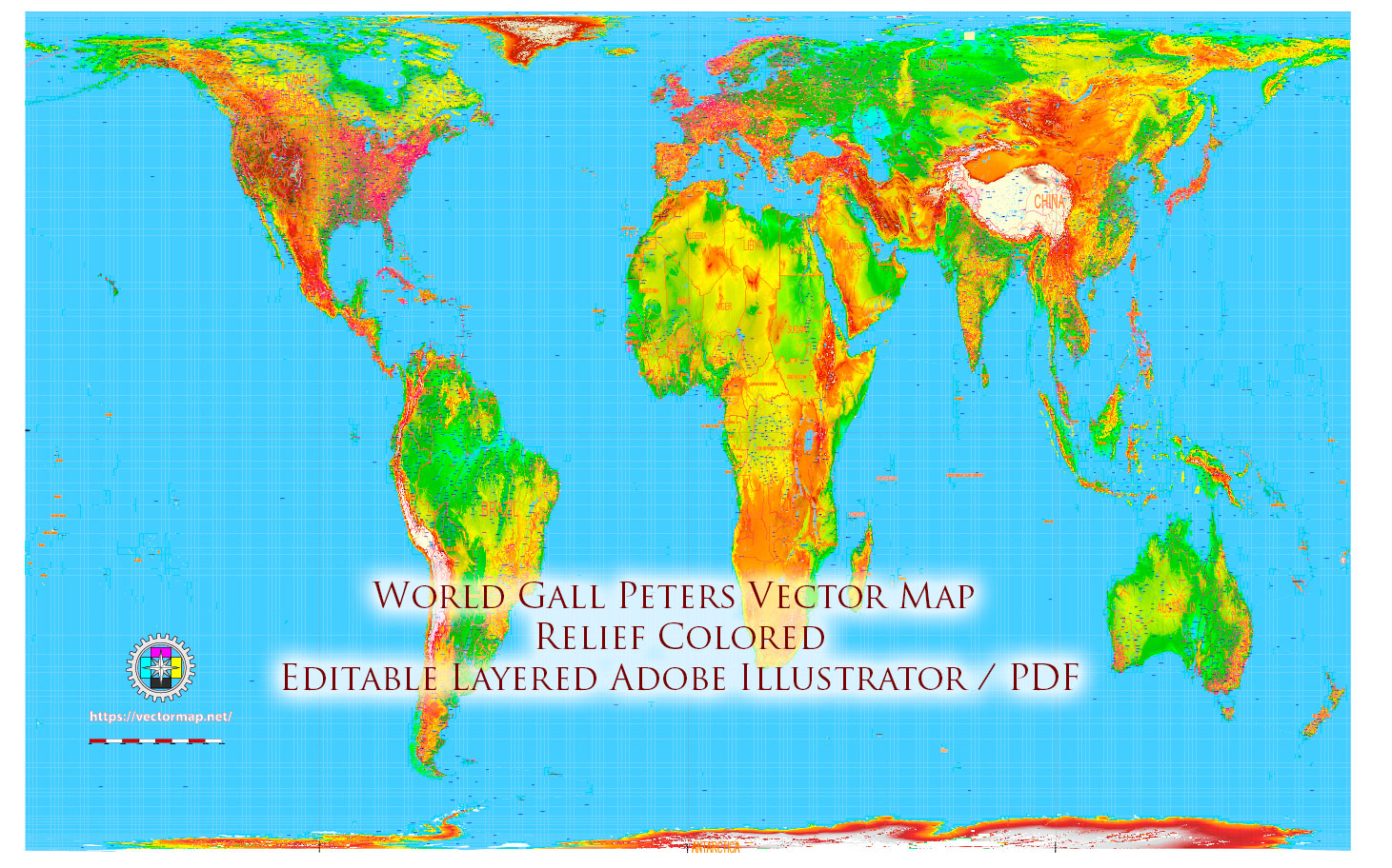
Figure 2. Equal Area – Gall Peters Projection Example.
3. Distance Distortion
Distances may be accurate only along specific lines or directions.
4. Direction Distortion
Certain projections preserve compass bearings, others do not.
There Is No Perfect Projection
This is one of the most important principles in cartography.
If someone says:
“This projection is correct.”
They are wrong.
The correct question is:
“Correct for what purpose?”
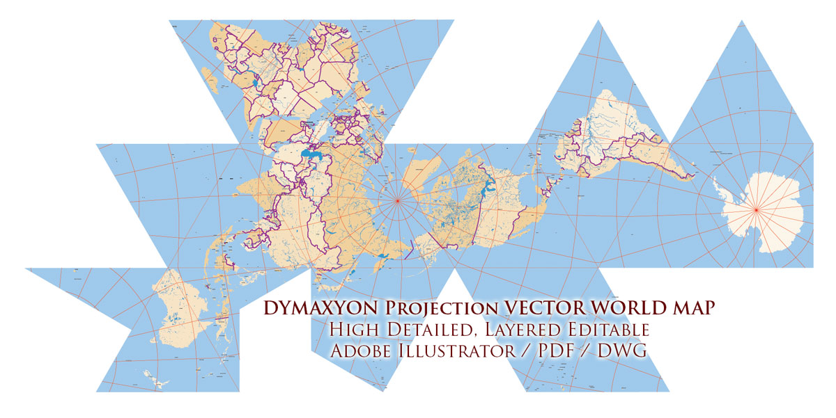
Figure 3. Dymaxion Projection Example.
Common Projections Used in Modern Cartography
Mercator Projection
Most commonly used for web maps.
Advantages:
-
Preserves angles
-
Useful for navigation
-
Rectangular grid
Disadvantages:
-
Extreme area distortion near poles
Suitable for:
-
City maps
-
Navigation
-
Small regional projects
Equal-Area Projections
Preserve true area relationships.
Useful for:
-
Thematic maps
-
Statistical visualization
-
Environmental maps
Shapes may appear distorted,
but area is correct.
Robinson Projection
A compromise projection.
Balanced distortion of area and shape.
Used in:
-
Educational atlases
-
World maps

Figure 4. Robinson Projection Example.
Goode Homolosine Projection
Interrupts oceans to preserve landmass proportions.
Suitable for:
-
Continental emphasis
-
Thematic world maps
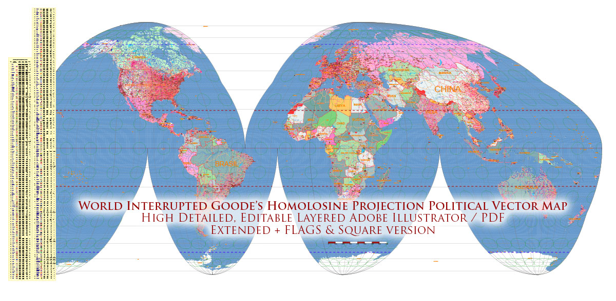
Figure 5. Goode Homolosine Projection Example.
Dymaxion Projection
Projects Earth onto an icosahedron.
Advantages:
-
Preserves continental continuity
-
Minimizes distortion across land
Disadvantages:
-
Visually unconventional
-
Requires careful design
Used in:
-
Experimental cartography
-
Global thematic projects
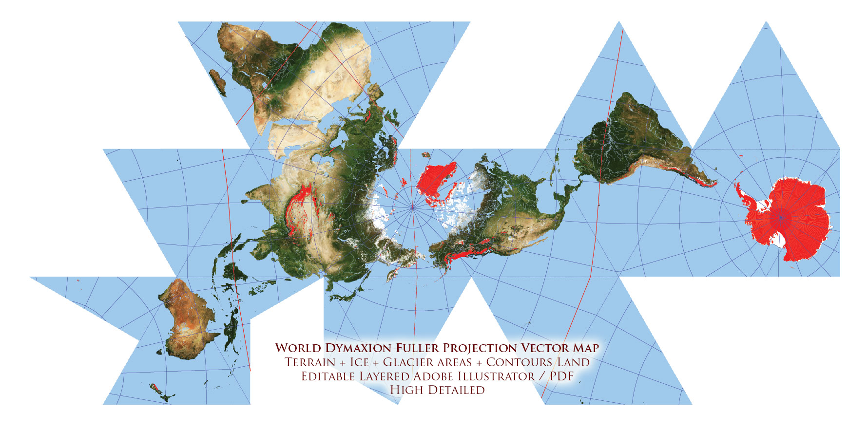
Figure 6. Dymaxion Projection Example – Dymaxion World Vector Map Fuller Projection Terrain + Ice – glaciers, continental and shelves Precision Areas Adobe Illustrator
Choosing a Projection for Print Maps
For most city maps:
Projected coordinate systems or Mercator-based systems are acceptable.
For country maps:
Consider equal-area or compromise projections.
For world maps:
Avoid naive Mercator unless distortion is intentional.
Projection choice must match:
-
Map scale
-
Geographic extent
-
Purpose of the map
-
Audience expectations
Practical Rule for Beginners
If you are mapping:
-
A single city → local projected system
-
A region → suitable national projection
-
A continent → equal-area or compromise
-
The world → avoid web Mercator
Projection should serve clarity.
Not habit.
Projection and Production Workflow
Projection affects:
-
Scale accuracy
-
Label spacing
-
Line curvature
-
Generalization behavior
-
File export precision
Changing projection mid-production is risky.
Choose projection at the beginning.
Stick with it.
What Happens If You Ignore Projection
You may experience:
-
Misaligned layers
-
Incorrect distances
-
Distorted shapes
-
Printing inconsistencies
-
Inaccurate measurements
Projection mistakes are subtle.
They become visible only when it is too late.
Professional Mindset
Projection is not decoration.
It is structural geometry.
Treat it as:
-
Engineering decision
-
Mathematical transformation
-
Foundational layer of the map
Not as a stylistic option.
Summary
A map projection:
-
Converts spherical Earth to flat space
-
Introduces unavoidable distortion
-
Must be chosen according to purpose
There is no distortion-free map.
There is only informed distortion.
Understanding projection is what separates a map user from a cartographer.
Next Chapter
Now that projection is defined,
we address a production-critical topic:
Frequently Asked Questions
Is there a projection without distortion?
No. Every map projection introduces distortion in shape, area, distance, or direction.
Why is Mercator distorted near the poles?
Mercator preserves angles but significantly enlarges areas near the poles.
Which projection is best for world maps?
There is no universal best projection. Equal-area or compromise projections are often preferred over Mercator.
Should projection be changed mid-project?
No. Projection should be chosen at the beginning and kept consistent.
Chapter 6 — Map Generalization and Scale Control
Map Generalization
How to Control Detail Without Destroying Shape
When beginners first see raw geodata,
they are impressed.
So many details.
So many vertices.
So much precision.
Then they try to print it.
And everything collapses.
Coastlines look noisy.
Roads look tangled.
File size explodes.
Illustrator slows down.
This is where generalization begins.
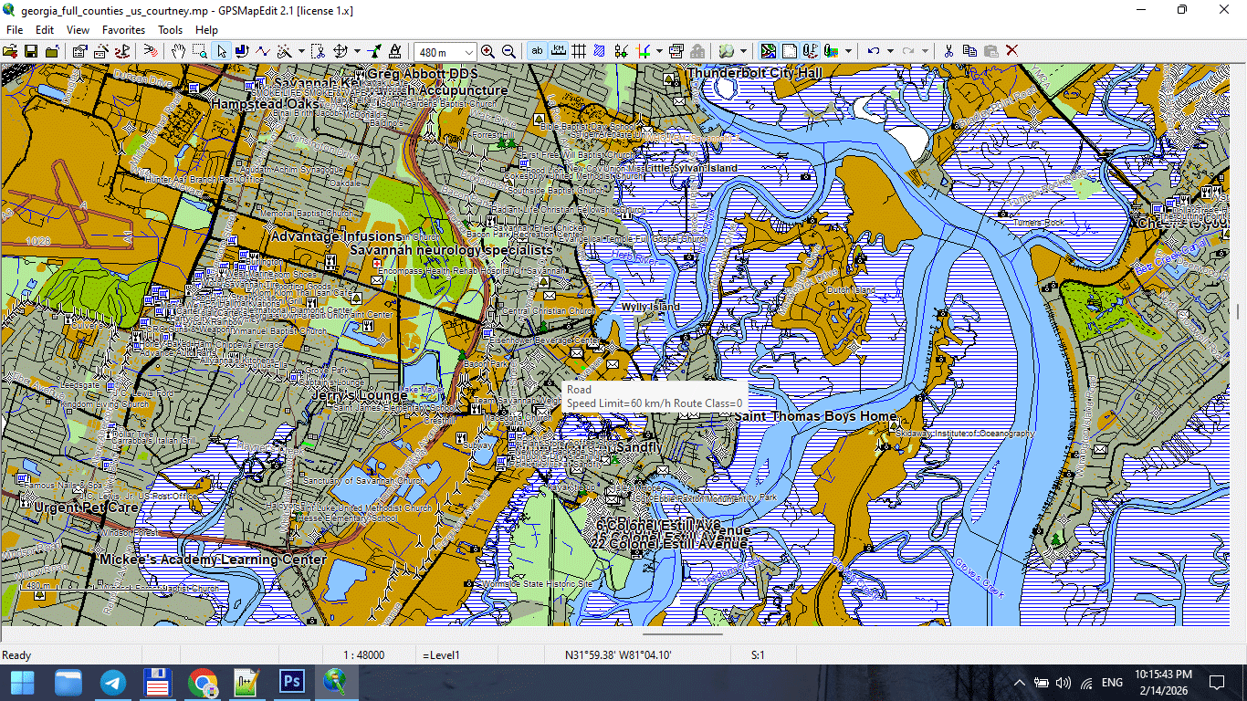
Figure 1. High-Detail Map at Large Scale.
What Is Map Generalization?
Map generalization is the controlled simplification of geographic data to match map scale and purpose.
It is not random deletion.
It is structured reduction.
Generalization allows you to:
-
Reduce visual noise
-
Improve readability
-
Stabilize file performance
-
Maintain recognizable shapes
-
Adapt data to print scale
Generalization is not data loss.
It is editorial decision-making.
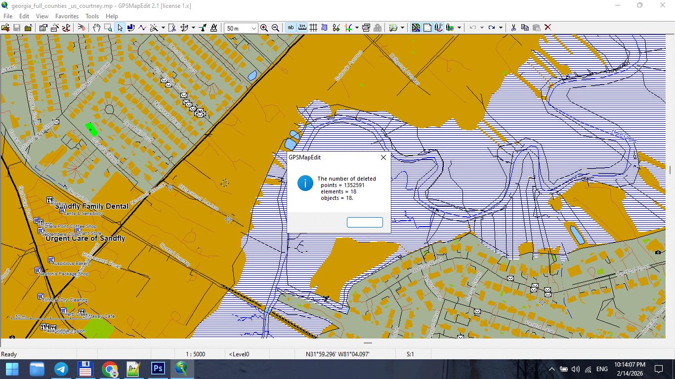
Figure 2. Line Simplification During Generalization.
Why Raw Data Is Not Print-Ready
Raw GIS datasets are built for:
-
Analysis
-
Measurement
-
Data storage
They are not built for:
-
Large-format wall maps
-
Visual clarity
-
Typography balance
-
Stroke hierarchy
Raw data is often:
-
Over-detailed
-
Fragmented
-
Over-segmented
-
Topologically heavy
If you skip generalization,
your print map will suffer.
The Relationship Between Scale and Detail
This is the key principle:
Generalization must match the final print scale — not the original data precision.
Example:
If your dataset contains 1-meter precision,
but your map scale is 1:250,000,
most of that detail is invisible and unnecessary.
Too much detail at small scale creates noise.
Less detail at large scale improves clarity.
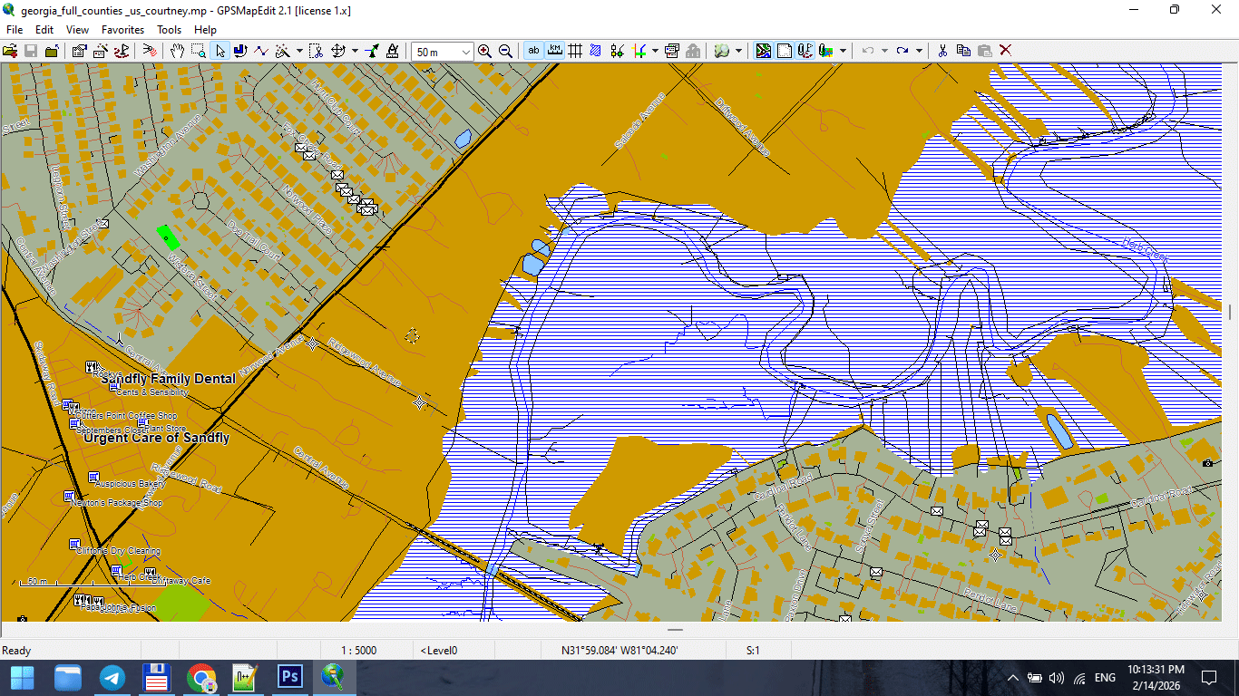
Figure 3. Small-Scale Map After Feature Generalization.
Types of Generalization
Professional cartography uses multiple forms of generalization.
1. Geometric Simplification
Reduces the number of vertices in lines and polygons.
Common algorithm:
Douglas–Peucker simplification.
Goal:
Preserve overall shape while reducing node count.
Danger:
Too aggressive simplification destroys coastline identity.
2. Topological Generalization
Maintains logical relationships between objects.
Ensures:
-
Roads remain connected
-
Polygons remain closed
-
Boundaries remain consistent
Never simplify geometry without preserving topology.
3. Semantic Generalization
Removes entire object classes based on scale.
For example:
At 1:5,000,000 scale:
-
Residential streets disappear
-
Small rivers disappear
-
Minor buildings disappear
This is not simplification —
it is selective omission.
4. Smoothing
Reduces sharp angles and visual “noise.”
Useful for:
-
Coastlines
-
Natural boundaries
-
Rivers
Must be applied carefully.
Over-smoothing destroys geographic character.
When to Generalize
Generalization should occur:
-
After topology cleaning
-
Before final Illustrator export
-
After classification standardization
Do not generalize raw, uncleaned data.
Fix structure first.
Simplify second.
Common Beginner Mistakes
-
Applying maximum simplification
-
Using the same tolerance for all layers
-
Simplifying roads and coastlines equally
-
Ignoring scale
-
Forgetting to save intermediate versions
Generalization is not “click once and done.”
It requires testing.
Practical Generalization Strategy
Instead of asking:
“How much can I simplify?”
Ask:
“How much can I remove while preserving recognizability?”
Guidelines:
-
Coastlines → light simplification
-
Administrative boundaries → moderate
-
Roads → controlled and tested
-
Buildings → often semantic removal at smaller scales
Tolerance and Scale
Tolerance values depend on:
-
Map scale
-
Geographic extent
-
Printing size
Example logic:
-
Large-scale city map → minimal simplification
-
Regional map → moderate simplification
-
National map → strong simplification
-
World map → aggressive semantic filtering
There is no universal number.
Only context.
Performance and Stability Benefits
Proper generalization:
-
Reduces file size
-
Speeds up Illustrator
-
Prevents export crashes
-
Improves stroke clarity
-
Enhances label placement
Unnecessary vertices are invisible in print
but destructive in production.
Recognizability Rule
After simplification:
-
Does the coastline still look correct?
-
Does the river still follow its natural curve?
-
Does the city still feel authentic?
If not — you simplified too much.
Recognizability is more important than geometric purity.
Professional Workflow Tip
Always keep versions:
map_generalized_v1.shp
map_generalized_v2.shp
Never overwrite your clean dataset.
You may need to adjust tolerance later.
Generalization in Software
Most GIS tools include:
-
Simplify Lines
-
Simplify Polygons
-
Topology-preserving simplification
But remember:
The tool does not decide quality.
You do.
Generalization is editorial judgment.
Summary
Map generalization is:
-
Controlled simplification
-
Scale adaptation
-
Performance optimization
-
Visual clarity management
It is not data destruction.
It is professional refinement.
Without generalization,
print cartography becomes unstable.
With correct generalization,
complex geography becomes readable.
Next Chapter
Now that the geometry is optimized,
we move to file formats and export logic.
Frequently Asked Questions
What is map generalization?
Map generalization is the controlled simplification of geographic data to match scale and improve readability.
What happens if I over-generalize?
Geographic shapes lose recognizability and become unrealistic.
Is generalization necessary for large maps?
Yes. Without simplification, files become heavy and visually noisy.
Should all layers use the same simplification tolerance?
No. Different object types require different levels of simplification.
Chapter 7 — Vector Formats: SHP, GeoJSON, AI and PDF
Vector File Formats
SHP, GeoJSON, AI and PDF in Professional Map Production
At some point, every map project faces a critical transition:
From data
to product.
GIS formats store geographic information.
Design formats produce publishable maps.
Understanding the difference is essential.
GIS Formats vs Design Formats
Let’s be clear:
GIS formats are for data.
Design formats are for presentation.
Confusing these stages creates chaos.
A professional workflow moves through formats intentionally.
Shapefile (SHP)
Shapefile remains one of the most widely used GIS formats.
Despite its age, it is stable and production-friendly.
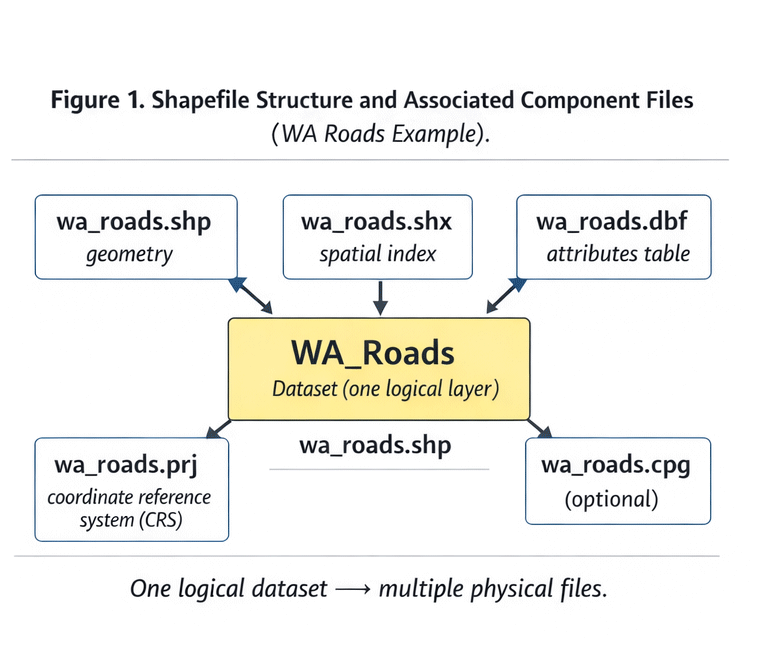
Figure 1. Shapefile Structure and Components.
What a Shapefile Actually Is
A shapefile is not one file.
It is a group of related components:
-
.shp— geometry -
.shx— geometry index -
.dbf— attribute table -
.prj— projection definition -
sometimes
.cpg,.qix, and others
If one component is missing, the dataset may break.
Why SHP Is Still Used
Advantages:
-
Industry standard
-
Broad software compatibility
-
Stable for large datasets
-
Easy to transfer
Limitations:
-
Field name length limits
-
No advanced topology
-
Multiple-file structure
-
No modern compression
Despite limitations, SHP works reliably for production.
GeoJSON
GeoJSON is a text-based geographic format built on JSON.
It is widely used in web mapping.
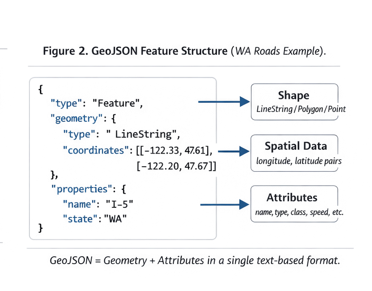
Figure 2. GeoJSON Data Structure Example.
Structure of GeoJSON
A typical GeoJSON file contains:
-
FeatureCollection
-
Features
-
Geometry objects
-
Properties (attributes)
It is readable and flexible.
When GeoJSON Is Useful
Best for:
-
Web applications
-
API-based workflows
-
Small datasets
-
Rapid prototyping
Limitations:
-
Large file sizes
-
Slow performance for heavy geometry
-
Not optimized for massive print projects
GeoJSON is excellent for web.
It is rarely ideal for large-format print production.
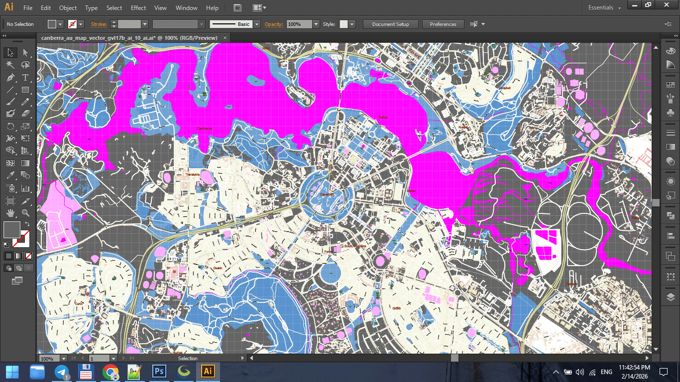
AI (Adobe Illustrator Format)
This is where cartographic data becomes design.
AI files:
-
Store vector paths
-
Maintain layers
-
Support typography
-
Enable stroke hierarchy
Illustrator is not a GIS tool.
It is a final production environment.
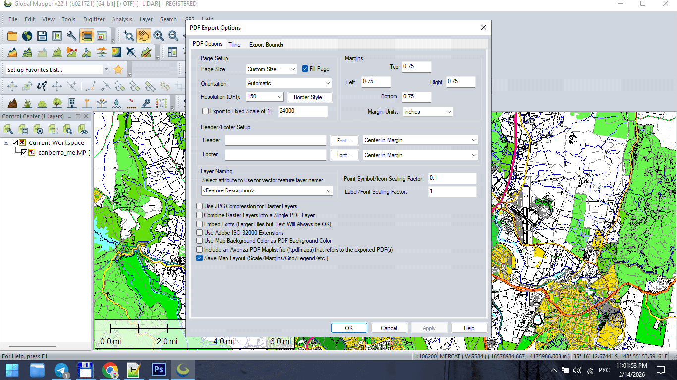
Figure 3. Vector Map Export for Print (AI/PDF).
Why AI 10 Is Often Preferred
Older Illustrator compatibility formats (such as AI 10) are often more stable for:
-
Large files
-
Complex geometry
-
Printing workflows
-
Cross-version compatibility
Modern versions sometimes introduce:
-
Transparency issues
-
Unexpected rendering behavior
-
Performance slowdowns
Stability matters more than novelty in production.
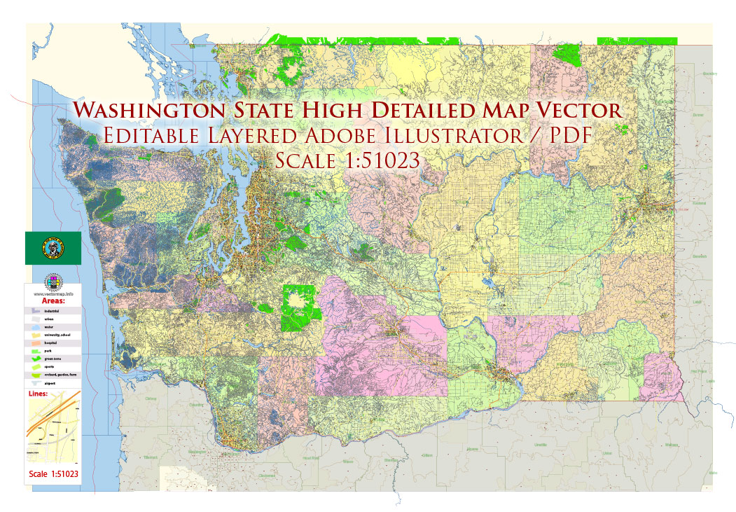
Figure 3a. Vector Map Export for Print (AI/PDF).
Vector PDF
The final destination for print maps.
A professional vector PDF must:
-
Contain 100% vector geometry
-
Preserve layer structure (if required)
-
Avoid unintended rasterization
-
Maintain stroke clarity
-
Use correct color mode (RGB or CMYK)
If a PDF becomes rasterized,
it is no longer production-grade.
Figure 3b. Vector Map Export for Print (AI/PDF).
GIS → Illustrator → PDF Workflow
Professional pipeline typically follows:
-
Clean SHP / GIS dataset
-
Generalize geometry
-
Export to AI-compatible format
-
Final design in Illustrator
-
Convert text to outlines
-
Export print-ready PDF
Each stage has a purpose.
Skipping stages creates instability.
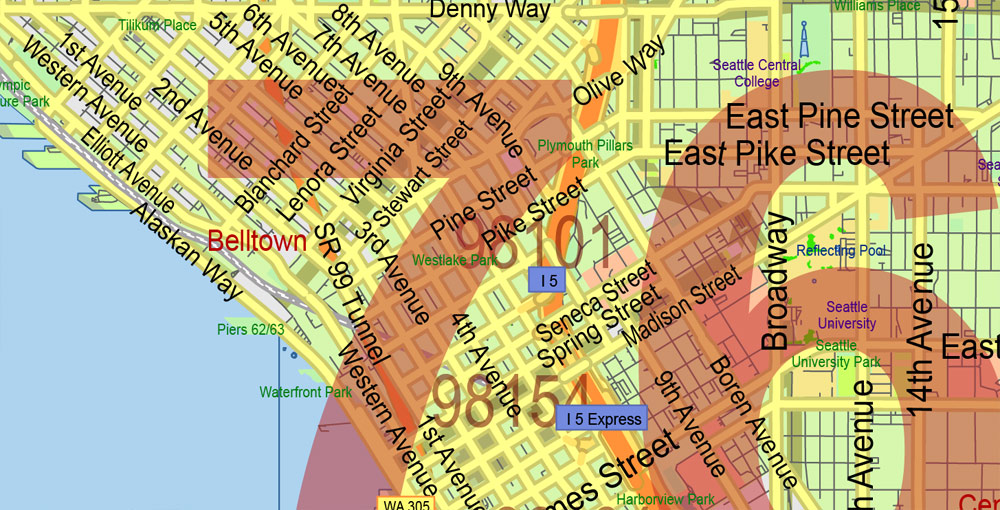
Figure 3c. Vector Map Export for Print (AI/PDF).
Why You Should Not Design Inside GIS
Many beginners attempt to finish maps directly in GIS software.
Problems:
-
Limited typography control
-
Poor layer styling flexibility
-
Export artifacts
-
Inconsistent stroke rendering
-
Weak print optimization
GIS prepares structure.
Illustrator finishes the product.
Common File Format Mistakes
-
Sending SHP files directly to print
-
Exporting raster PDF instead of vector
-
Ignoring projection metadata
-
Mixing RGB and CMYK unintentionally
-
Flattening layers too early
-
Losing attribute information during export
Professional production respects format boundaries.
File Size and Performance
Large vector maps can reach:
-
Hundreds of MB
-
Millions of nodes
-
Thousands of layers
To maintain stability:
-
Remove unnecessary attributes
-
Generalize geometry
-
Keep layer structure clean
-
Avoid excessive effects
Performance is not accidental.
It is engineered.
Choosing the Right Format at Each Stage
Use:
-
SHP → for structured geodata
-
GeoJSON → for web workflows
-
AI → for cartographic design
-
PDF → for final print delivery
Each format has a role.
Misusing formats causes friction.
Summary
Vector file formats define workflow.
GIS formats:
-
Store data
-
Preserve attributes
-
Maintain spatial structure
Design formats:
-
Control visual hierarchy
-
Manage typography
-
Prepare for printing
Professional cartography moves through formats deliberately.
Data becomes structure.
Structure becomes design.
Design becomes product.
Next Chapter
Now that format logic is clear,
we move to the full production pipeline.
Frequently Asked Questions
What is the difference between SHP and AI files?
SHP stores geographic data and attributes. AI is used for final cartographic design.
Can I send a shapefile directly to print?
No. Shapefiles must be styled and refined in a design environment before printing.
Is vector PDF better than raster PDF for maps?
Yes. Vector PDF maintains sharp lines and scalable geometry.
Why convert text to outlines before printing?
To prevent font substitution and rendering errors.
Chapter 8 — Professional Map Production Workflow
Professional Map Production Workflow
From Raw GIS Data to a Stable Print-Ready Map
By now you understand:
-
What a vector map is
-
How to obtain geodata
-
Why topology matters
-
How projections distort
-
Why generalization is essential
-
How file formats work
Now we assemble everything into a controlled production pipeline.
Because professional cartography is not a set of tricks.
It is a system.
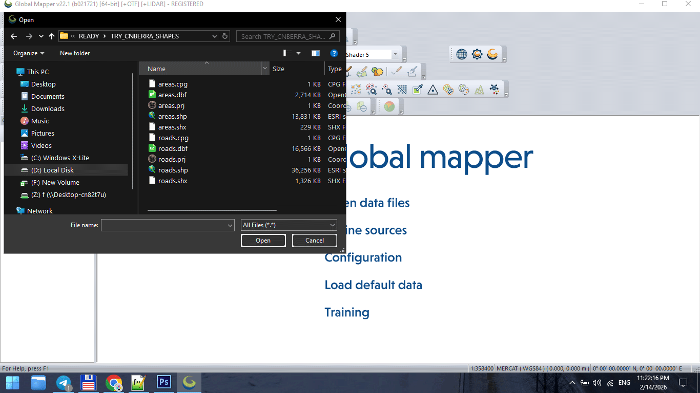
Figure 1. Raw GIS Data Import Stage.
The Complete Production Sequence
A stable vector map is created in stages:
-
Data acquisition
-
CRS alignment
-
Topology cleaning
-
Graph correction
-
Classification standardization
-
Generalization
-
Format export
-
Illustrator refinement
-
Print validation
Skipping stages causes instability later.
Stage 1 — Import Raw Data
Raw SHP or OSM extract is never ready for production.
Typical problems at this stage:
-
Inconsistent projection
-
Broken polygons
-
Duplicate segments
-
Attribute overload
-
Unnecessary object classes
Before doing anything else:
Inspect the dataset.
Never assume it is clean.
Stage 2 — Coordinate Reference System Alignment
All layers must share the same CRS.
Failure to align projection causes:
-
Offset layers
-
Misaligned boundaries
-
Incorrect scaling
-
Label distortion
CRS alignment is foundational.
Do it once, do it correctly.
Stage 3 — Topology Cleaning
Topology ensures geometric correctness.
Fix:
-
Unclosed polygons
-
Self-intersections
-
Duplicate boundaries
-
Micro-gaps
-
Overlapping lines
Topology errors may not be visible immediately.
But they appear during:
-
Simplification
-
Styling
-
Export
-
Printing
Clean topology prevents future chaos.
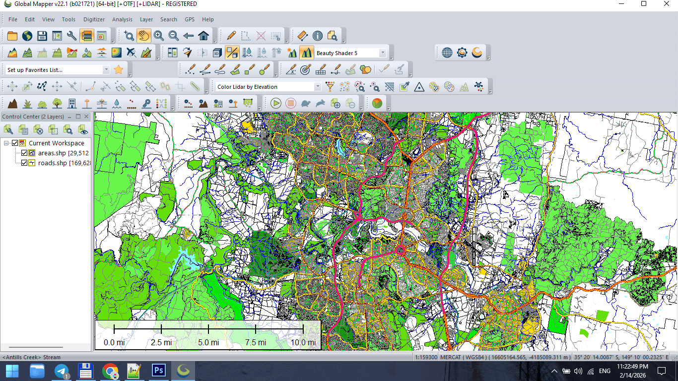
Figure 2. Topology Cleaning and Data Preparation.
Stage 4 — Structural Graph Validation
The street network must:
-
Be fully connected
-
Have no broken intersections
-
Have standardized classification
-
Avoid duplicate segments
The road graph defines structural logic.
If graph integrity fails, styling cannot compensate.
Stage 5 — Classification Standardization
Before design begins:
Unify road categories.
Example structure:
-
Motorway
-
Primary
-
Secondary
-
Tertiary
-
Residential
Standardized classification makes hierarchy predictable.
Without it, layer logic becomes unstable.
Stage 6 — Controlled Generalization
Apply simplification carefully.
Match tolerance to:
-
Final print scale
-
Geographic extent
-
Target audience
Over-simplification destroys recognizability.
Under-simplification overloads the map.
Balance is professional judgment.
Stage 7 — Intermediate Save
At this point, create a stable base file:
This becomes your production master.
Never export directly from raw data.
Stage 8 — Export to Design Environment
Export cleaned dataset to AI-compatible format.
Check:
-
Geometry integrity
-
Layer separation
-
Stroke conversion
-
Projection consistency
Do not apply final styling inside GIS.
Keep structure clean.
Figure 3. Final Print Map Preparation.
Stage 9 — Illustrator Refinement
Now design begins.
In Illustrator:
-
Organize layers
-
Establish stroke hierarchy
-
Apply typography
-
Adjust visual balance
-
Refine color palette
GIS builds structure.
Illustrator builds clarity.
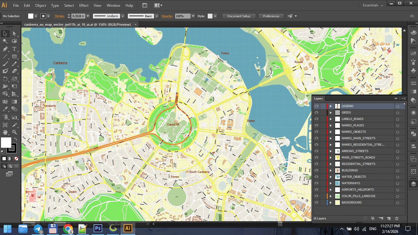
Figure 3a. Final Print Map Preparation.
Stage 10 — Performance Optimization
Large vector maps can become unstable.
Optimize by:
-
Removing unused objects
-
Reducing hidden layers
-
Avoiding unnecessary transparency
-
Keeping stroke styles simple
Performance is part of production discipline.
Figure 3b. Final Print Map Preparation.
Stage 11 — Print Validation
Before final export:
-
Zoom to 100% print scale
-
Check label readability
-
Inspect stroke consistency
-
Verify color mode
-
Print a test fragment
Screen approval is not print approval.
Always test physically.
Figure 3c. Final Print Map Preparation.
Version Control Discipline
Professional workflow includes incremental saves:
v3_standardized
v4_generalized
v5_design
v6_print
Never overwrite stages.
Production errors are inevitable.
Recovery must be possible.
Why Workflow Discipline Matters
Without discipline:
-
Files become unstable
-
Export fails
-
Layers become chaotic
-
Revisions become impossible
With discipline:
-
Complex maps remain manageable
-
Large-scale printing becomes predictable
-
Projects remain reproducible
Cartography is engineering.
Engineering requires process.
Production Mindset
Think like an architect.
You do not decorate before the structure stands.
You do not simplify before cleaning.
You do not print before testing.
Every stage prepares the next one.
What Separates Amateur from Professional
Amateur workflow:
Import → Style → Export.
Professional workflow:
Import → Clean → Structure → Validate → Simplify → Export → Design → Test → Finalize.
The difference is not talent.
The difference is discipline.
Summary
Professional vector map production is:
-
Sequential
-
Structured
-
Controlled
-
Reproducible
It is not artistic improvisation.
It is engineered clarity.
When workflow is stable,
complex geography becomes manageable.
Next Chapter
Now that production structure is clear,
we move to the final critical stage:
Frequently Asked Questions
What is the correct order of map production?
Import → Clean → Validate → Generalize → Export → Design → Test → Finalize.
Why is version control important in cartography?
It prevents data loss and allows rollback if errors occur.
Should I simplify data before cleaning topology?
No. Clean structure first, simplify second.
Is Illustrator a GIS replacement?
No. Illustrator is for visual refinement, not structural data correction.
Chapter 9 — Preparing a Vector Map for Print in Illustrator
Preparing a Vector Map for Print in Illustrator
Final Design, Performance Stability and Print-Ready Validation
Up to this point, everything was preparation.
Now comes refinement.
GIS structured the data.
Generalization optimized geometry.
Workflow stabilized the process.
Illustrator turns structure into product.
This stage determines whether your map is truly professional.
Opening the Exported File
After exporting from GIS, you typically receive:
-
A large vector PDF
or -
An AI-compatible file
Opening may take time.
Large vector maps can contain:
-
Millions of nodes
-
Thousands of objects
-
Dozens of layers
Performance depends on RAM and file optimization.
If Illustrator slows down, do not panic.
Work systematically.
Step 1 — Organize Layers Properly
Often, exported files arrive:
-
In one single layer
-
With mixed geometry
-
Without logical grouping
This must be fixed immediately.
Separate into structured layers:
-
roads_primary
-
roads_secondary
-
roads_residential
-
railways
-
buildings
-
water
-
landuse
-
labels_major
-
labels_minor
-
background
Clear layer naming prevents chaos later.
Professional maps may contain 40–60 layers.
That is normal.
Step 2 — Establish Stroke Hierarchy
Stroke weight determines visual logic.
Adjust based on final print scale.
Example hierarchy (varies by scale):
-
Motorways → thickest stroke
-
Primary roads → medium
-
Secondary roads → thinner
-
Residential → light
Stroke contrast must be visible at distance.
If major roads do not dominate visually,
hierarchy failed.
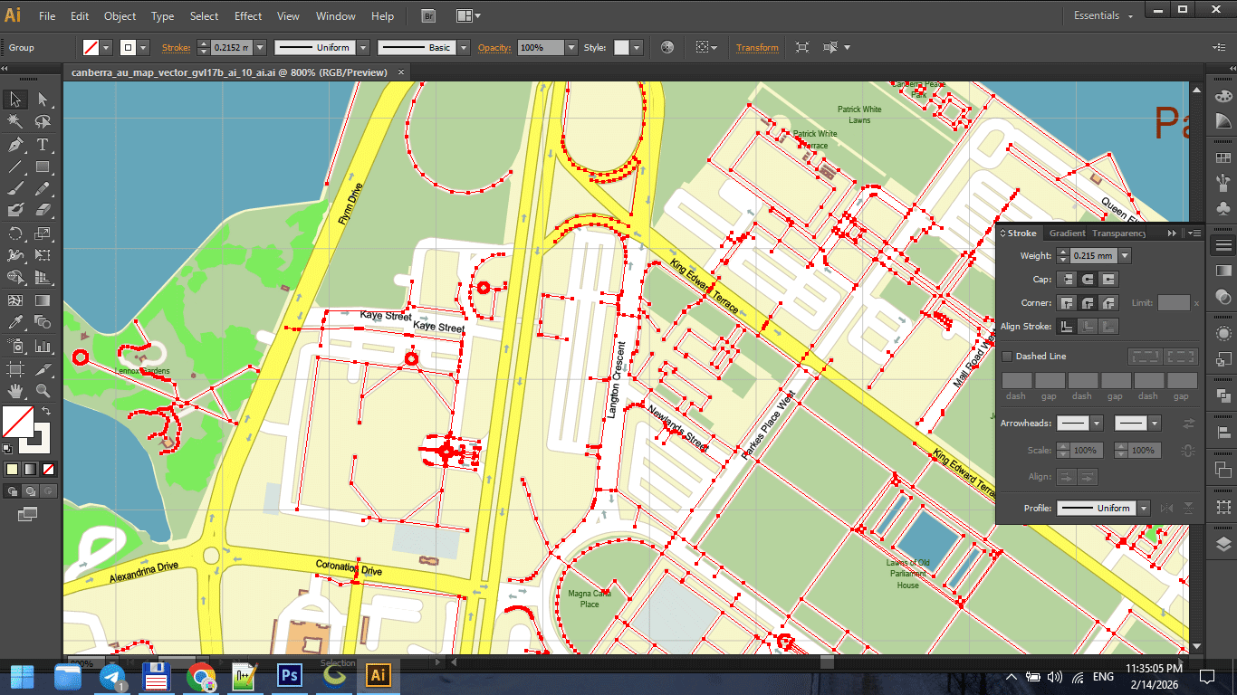
Figure 1. Stroke Weight Hierarchy in Print Maps.
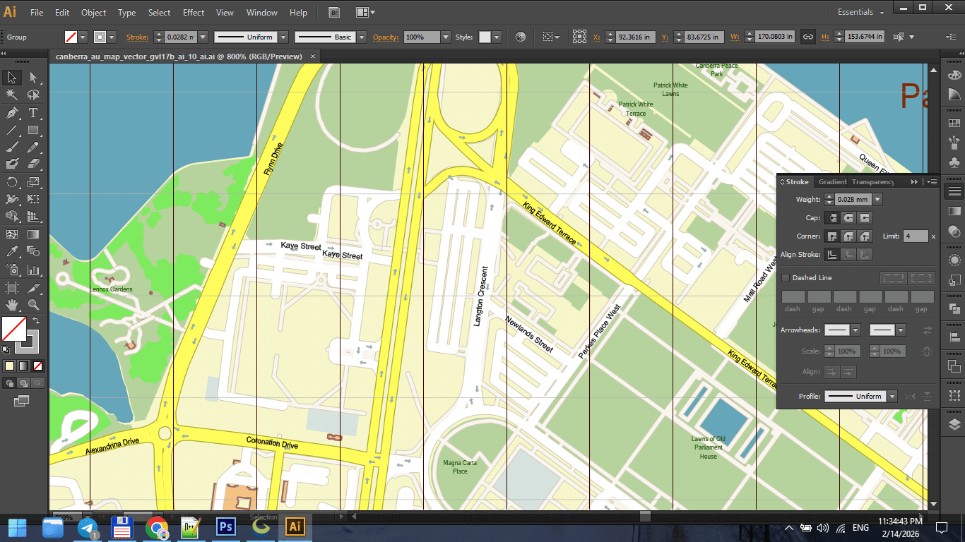
Figure 1a. Stroke Weight Hierarchy in Print Maps.
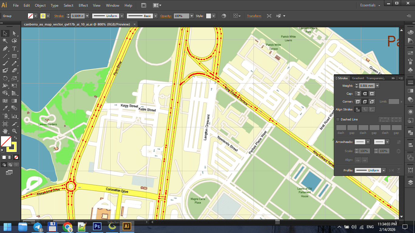
Figure 1b. Stroke Weight Hierarchy in Print Maps.
Step 3 — Typography Control
Typography is not decoration.
It is information hierarchy.
Ensure:
-
Consistent font families
-
Controlled font weights
-
Proper letter spacing
-
Avoidance of label collisions
-
Logical curvature on streets
Never overload with too many fonts.
Two or three families are usually enough.
Readability always overrides style.
Step 4 — Color Discipline
Color must support structure.
Avoid:
-
Over-saturation
-
Random palette choices
-
Strong gradients
-
Excessive contrast
For print maps:
-
Consider CMYK early
-
Avoid neon-like RGB tones
-
Keep background neutral
If colors overpower structure, reduce intensity.
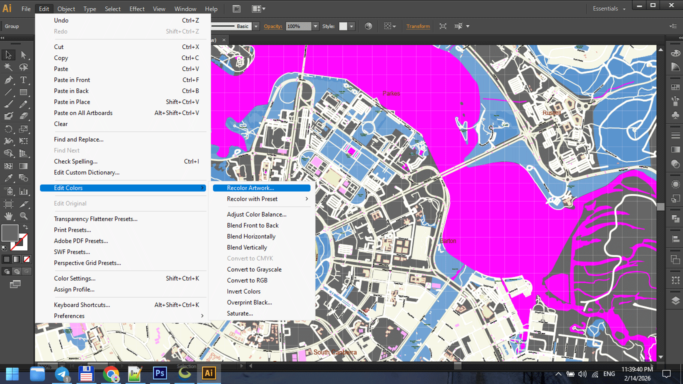
Figure 2. Cartographic Color Palette for Print.
Step 5 — Performance Optimization in Illustrator
Large vector maps can slow down Illustrator.
To improve performance:
-
Disable unnecessary effects
-
Avoid transparency unless required
-
Turn off GPU preview if unstable
-
Work with non-active layers hidden
-
Save frequently
Sometimes saving to an older AI compatibility version improves stability.
Stability is more important than modern features.

Figure 3. Print Scale Preview at 1:1.
Step 6 — Collision and Overlap Cleaning
Manual inspection is essential.
Check:
-
Overlapping labels
-
Road name collisions
-
Hidden text
-
Stroke intersections
-
Artifacts at complex junctions
Automated tools help,
but final polish requires human inspection.
This is the most time-consuming stage.
It is also what separates amateur from professional.
Step 7 — Print Scale Validation
Zooming in is misleading.
Instead:
-
View at 100% intended print size
-
Step back from screen
-
Print a small test fragment
Ask:
-
Are primary roads clear?
-
Are labels readable?
-
Is hierarchy obvious?
-
Is density balanced?
Maps are read at distance.
Design must account for that.
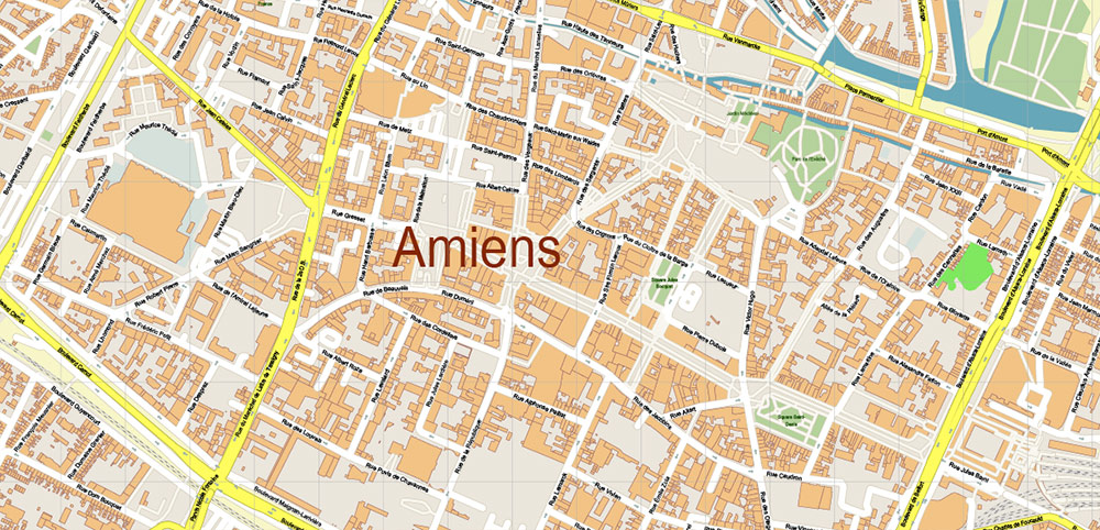
Figure 3a. Print Scale Preview at 1:1.
Step 8 — Convert Text to Outlines (Final Stage Only)
Before sending to print:
Convert text to outlines.
This prevents:
-
Font substitution
-
Missing glyph issues
-
Rendering differences
Important:
Keep a pre-outline version saved separately.
Once text is outlined, editing becomes harder.
Step 9 — Export Print-Ready PDF
Final PDF must:
-
Contain 100% vector geometry
-
Avoid unintended rasterization
-
Use correct color mode
-
Preserve stroke clarity
-
Maintain correct scaling
Check:
-
File weight
-
Zoom clarity
-
No pixelation
-
No transparency flattening artifacts
If something looks rasterized, re-check export settings.
Lighting and Real-World Conditions
Professional print maps are used:
-
On walls
-
In offices
-
In vehicles
-
In low light
Test readability under different lighting.
A map that looks good on a bright monitor
may fail on a dim wall.
Common Illustrator-Stage Mistakes
-
Styling before organizing layers
-
Overusing effects
-
Ignoring print scale
-
Forgetting CMYK conversion
-
Sending live text to print
-
Not testing at physical size
Design discipline matters.
Final Quality Checklist
Before final export:
-
CRS was correct from the beginning
-
Topology cleaned
-
Generalization applied
-
Stroke hierarchy consistent
-
Typography readable
-
No label collisions
-
Color palette controlled
-
Text converted to outlines
-
Test print approved
If all conditions are met,
your map is production-ready.
Summary
Illustrator is not where data begins.
It is where structure becomes clarity.
Professional map preparation requires:
-
Layer discipline
-
Stroke control
-
Typography precision
-
Performance awareness
-
Print validation
The difference between a decorative map
and a professional cartographic product
is refinement.
And refinement happens here.
Next Chapter
Before closing the guide,
we will review the most common beginner mistakes
that quietly ruin map projects.
Frequently Asked Questions
Why does Illustrator slow down with large maps?
Large vector maps contain millions of nodes. Optimization and layer control are necessary.
When should text be converted to outlines?
Only at the final stage before sending to print.
Why is print testing necessary?
Screen previews do not accurately represent physical print conditions.
Should I work in RGB or CMYK?
For print production, CMYK is typically required.
Chapter 10 — Common Mistakes in Vector Map Production
Common Mistakes in Vector Map Production
What Quietly Ruins Map Projects — and How to Avoid It
Most map projects do not fail dramatically.
They fail quietly.
-
A slightly wrong projection.
-
A broken road intersection.
-
Overloaded detail.
-
Weak hierarchy.
-
No print test.
Each mistake alone seems minor.
Together they destroy clarity.
This chapter summarizes the most common production errors — especially among advanced beginners.
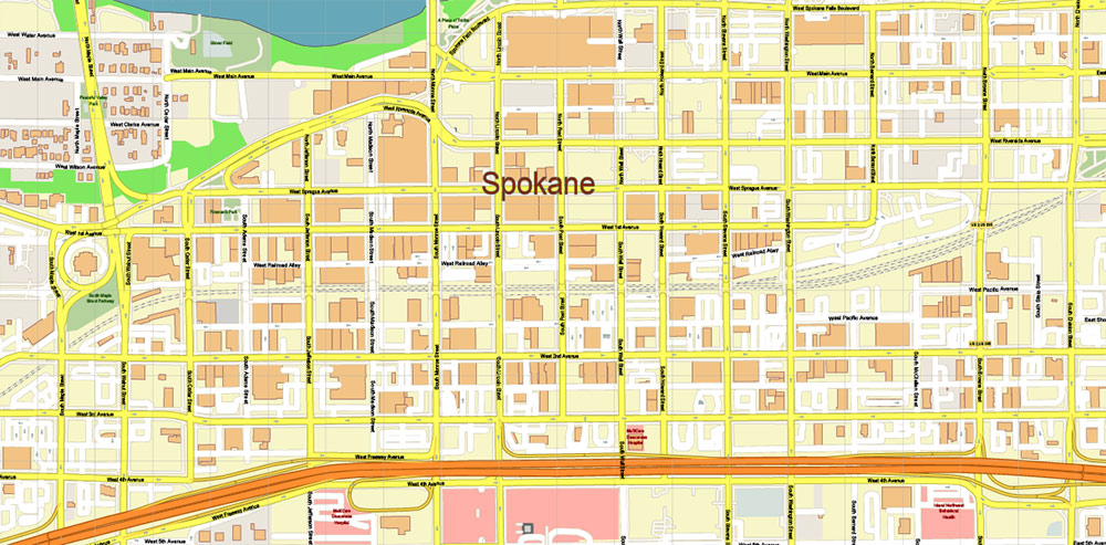
Figure 1. Printable Version – Spokane Washington US Map Vector High Detailed Street Map editable Adobe Illustrator in layers
1. Mixing Coordinate Systems
This is one of the most dangerous mistakes.
Symptoms:
-
Roads do not align perfectly
-
Buildings appear shifted
-
Boundaries slightly offset
-
Labels look misplaced
Cause:
Working with layers in different CRS.
Solution:
-
Choose projection at the beginning
-
Reproject all datasets
-
Verify alignment before editing
Projection errors are subtle — until they become catastrophic.
2. Skipping Topology Cleaning
Raw data always contains structural problems.
If you skip topology cleaning:
-
Polygons fail during export
-
Intersections misbehave
-
Simplification breaks geometry
-
Printing reveals artifacts
Cleaning topology is not optional.
It is foundational.
3. Overloading Detail
Beginners often think:
“More detail = better map.”
It is the opposite.
Too much detail creates:
-
Visual noise
-
Heavy files
-
Slow Illustrator performance
-
Unreadable print
Professional maps remove information strategically.
Clarity beats density.
4. Over-Generalization
The opposite mistake.
Too much simplification:
-
Destroys coastline identity
-
Removes small but important rivers
-
Flattens natural curves
-
Makes cities look artificial
Generalization must preserve recognizability.
If geography no longer feels authentic — you simplified too much.
5. Weak Layer Hierarchy
Without clear hierarchy:
-
Major roads do not stand out
-
Parks dominate structure
-
Buildings overpower streets
-
Labels compete with geometry
Hierarchy must be intentional.
If everything screams, nothing is heard.
6. Poor Typography
Common problems:
-
Too many fonts
-
Inconsistent sizes
-
Overlapping labels
-
Excessive curvature
-
Decorative overuse
Typography is functional.
If labels are hard to read, the map fails.
7. Designing Inside GIS
GIS tools are excellent for structure.
They are not ideal for:
-
Advanced typography
-
Fine stroke control
-
Large-format print finishing
Trying to finish everything in GIS usually produces mediocre results.
Structure in GIS.
Refinement in Illustrator.
8. Ignoring Performance Discipline
Large vector maps can reach:
-
Millions of nodes
-
Hundreds of megabytes
Without discipline:
-
Illustrator crashes
-
Export fails
-
Revisions become painful
Remove unnecessary vertices.
Control layers.
Avoid excessive effects.
Performance is part of professionalism.
9. No Test Print
This mistake is surprisingly common.
Maps approved on screen
may fail on paper.
Always:
-
Print a fragment at 100% scale
-
Check under real lighting
-
Step back and evaluate readability
A map exists in physical space.
Test it there.
10. No Version Control
Overwriting files leads to:
-
Lost work
-
No rollback
-
Panic during revisions
Professional workflow always keeps stages:
-
raw
-
cleaned
-
generalized
-
designed
-
print-ready
Never overwrite your master.
11. Designing for Yourself, Not the Reader
This is subtle but critical.
Ask:
-
Is the map readable for someone unfamiliar with the city?
-
Is hierarchy obvious?
-
Is color meaningful?
-
Is the structure intuitive?
Cartography is communication.
The reader matters more than your preferences.
What Separates Amateur from Professional
Amateur workflow:
Import → Style → Export.
Professional workflow:
Import → Clean → Structure → Validate → Simplify → Design → Test → Finalize.
The difference is discipline.
Not talent.
Not software.
Discipline.
Final Professional Reminder
A map is not:
-
Decoration
-
Illustration
-
Background image
A map is:
-
A spatial model
-
A communication tool
-
A decision-making instrument
Every mistake reduces clarity.
Every refinement increases value.
Final Summary of the Guide
Professional vector map production requires:
-
Clean data
-
Correct projection
-
Stable topology
-
Controlled generalization
-
Clear hierarchy
-
Strong typography
-
Disciplined workflow
-
Physical print validation
When all these elements work together,
geography becomes readable.
That is professional cartography.
End of Guide
You now have a complete structured production methodology
for creating professional vector maps for print.
The difference between random output
and engineered cartography
is process.
And now you have one.
Go to Start Page: Technology of Vector Map Production
Frequently Asked Questions
What is the most common mistake in map production?
Skipping structural cleanup and relying on styling alone.
Why do maps fail at the final stage?
Because projection, topology, or generalization errors were ignored early.
Is more detail always better?
No. Excess detail reduces readability.
What separates professional from amateur cartography?
Structured workflow discipline.