Cartographic Layer Hierarchy
Why Visual Order Determines Whether a Map Works or Fails
You can have perfect data.
You can have clean topology.
You can have correct projection.
And still produce a bad map.
Why?
Because cartography is not only about data.
It is about visual hierarchy.
Layer order determines readability.
If hierarchy is wrong — the map fails.
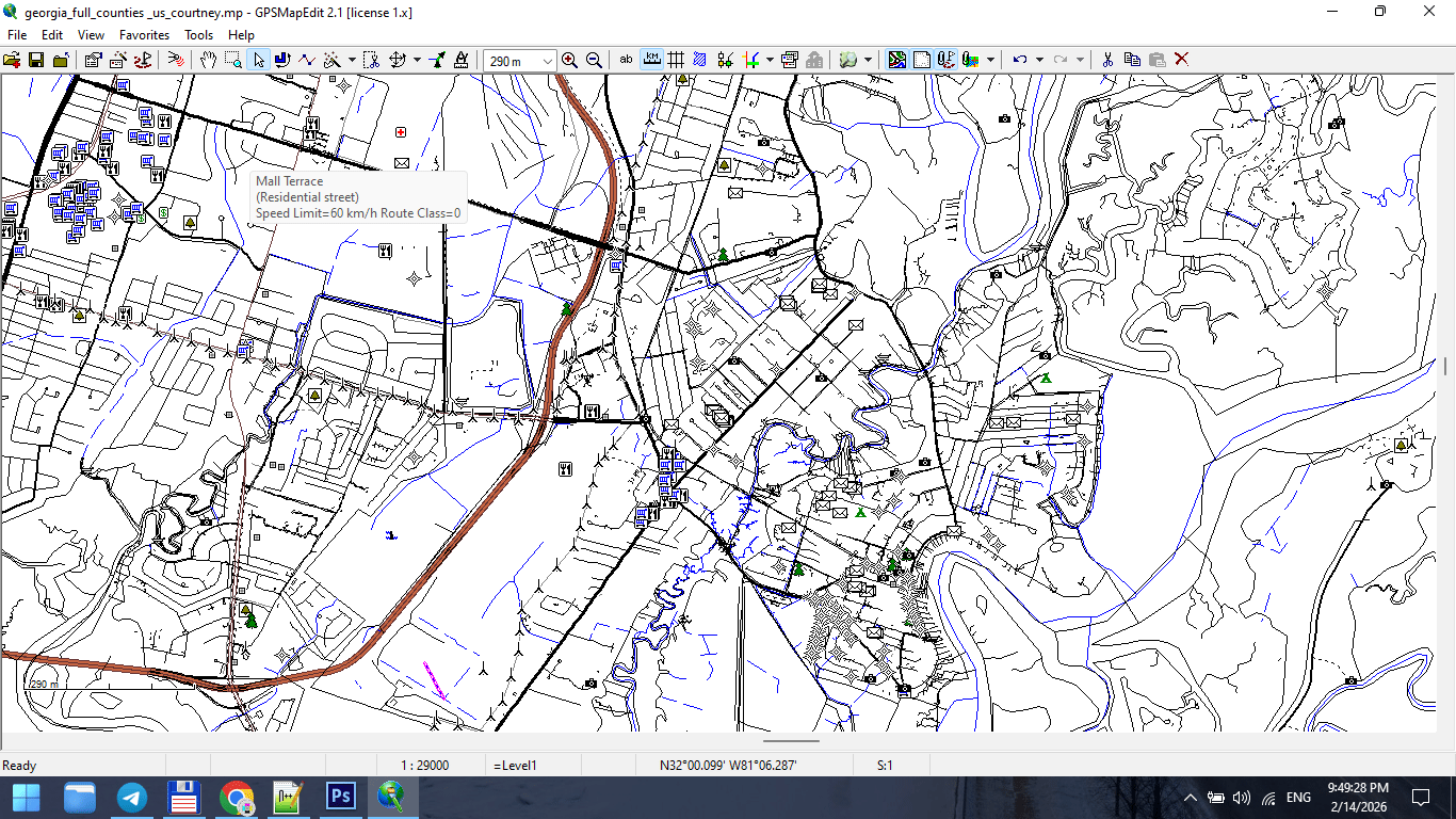
Figure 1. Urban Map Layer Breakdown.
What Is Layer Hierarchy?
Layer hierarchy is the controlled order in which map elements are stacked and visually weighted.
In digital form, this means:
-
Layer stacking order
-
Stroke weight
-
Color contrast
-
Label priority
In print form, it means:
-
What the eye sees first
-
What remains visible at distance
-
What disappears when light is weak
Hierarchy is not decoration.
It is structure.
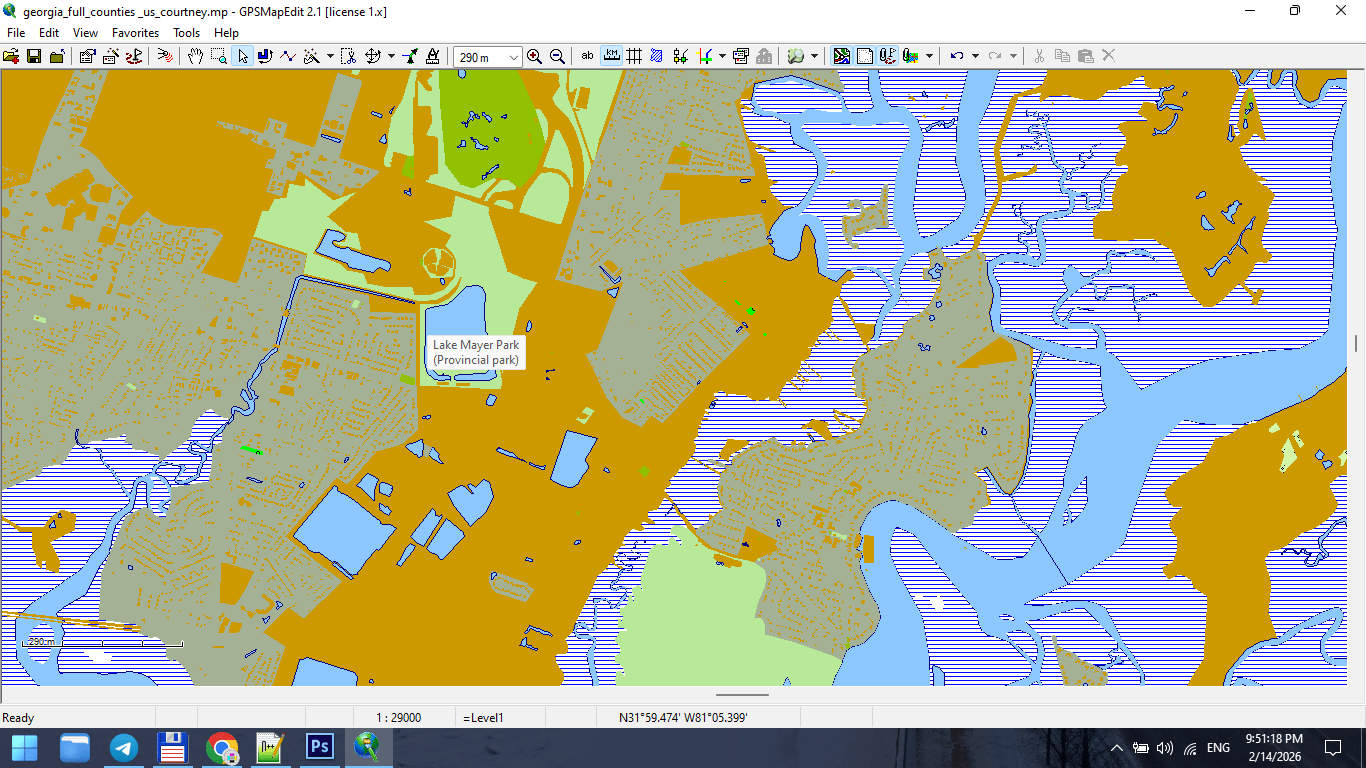
Figure 2. Cartographic Layer Stack from Bottom to Top.
The Rule of Visual Gravity
The human eye moves from:
-
Strong contrast
-
Thick strokes
-
Large text
-
Bright colors
If your hierarchy ignores this,
the map becomes visually chaotic.
Design must guide the eye.
Typical Layer Order for a City Map
From top to bottom:
1. Major Labels
-
City names
-
District names
-
Important landmarks
Text must sit above everything.
2. Road Names
-
Motorways
-
Primary streets
Typography must remain readable at 100% print scale.
3. Major Roads
-
Highways
-
Primary roads
Usually thicker strokes and stronger color contrast.
4. Secondary Roads
-
Secondary streets
-
Tertiary streets
Reduced stroke weight.
5. Minor Streets
-
Residential roads
-
Service roads
Light stroke weight. Lower visual dominance.
6. Railways
Usually below major roads but above buildings.
7. Buildings
Typically subtle fill color.
Buildings must support structure — not dominate it.
8. Water Bodies
Lakes, rivers, canals.
Water provides spatial orientation.
9. Land Use / Parks
Very light background colors.
Should never overpower roads.
10. Background
Neutral tone.
Background is critical.
If too bright → roads disappear.
If too dark → labels lose contrast.
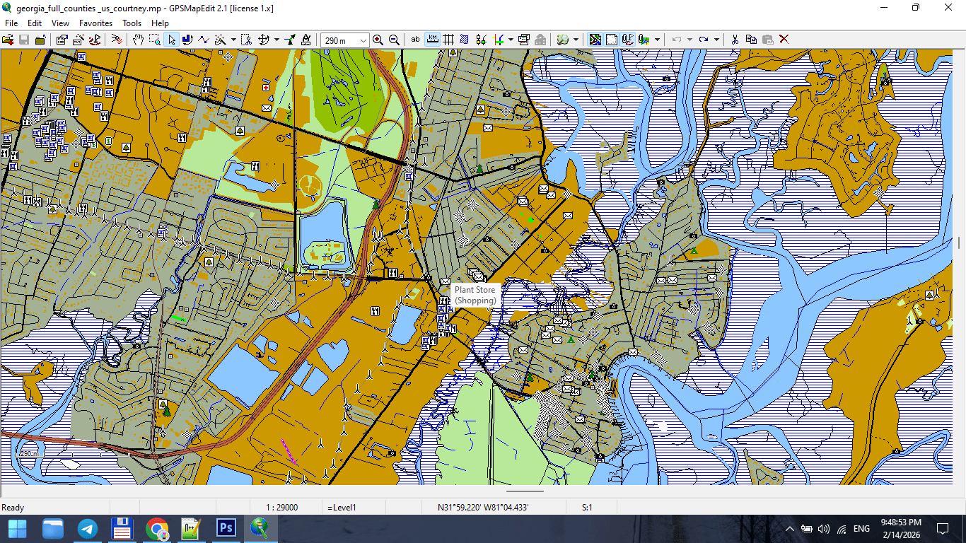
Figure 3. Final Map Composition After Layer Stacking.
Stroke Weight Hierarchy
Stroke weight communicates importance.
Example:
-
Motorway: 1.2 pt
-
Primary road: 0.9 pt
-
Secondary road: 0.6 pt
-
Residential: 0.3 pt
Exact values depend on scale.
But relative hierarchy must be consistent.
If residential roads are thicker than primary roads,
your visual logic collapses.
Typography Is Not Decoration
Typography must:
-
Be readable at print scale
-
Avoid collisions
-
Follow street curvature correctly
-
Maintain consistent font hierarchy
Avoid:
-
Too many font styles
-
Overlapping labels
-
Excessive curvature
-
Random rotation
The map reader must never struggle to read.
Readability Test
Print a fragment at 100%.
Place it on a wall.
Step back 2–3 meters.
Ask yourself:
-
Are major roads immediately visible?
-
Are labels readable?
-
Is spatial structure clear?
If not — revise hierarchy.
Screen preview is misleading.
Print reveals truth.
Color Discipline
Color should support structure.
Avoid:
-
Excessive saturation
-
Too many contrasting hues
-
Decorative gradients
Professional maps often use:
-
Limited color palette
-
Controlled contrast
-
Functional differentiation
Color is hierarchy — not decoration.
Common Hierarchy Mistakes
-
Too many layers competing for attention
-
Parks brighter than roads
-
Buildings darker than highways
-
Labels hidden below strokes
-
No clear contrast between primary and secondary roads
Hierarchy must be intentional.
Layer Management in Practice
In complex projects, 40–60 layers are normal.
Professional layer naming:
-
roads_primary
-
roads_secondary
-
labels_major
-
buildings_fill
-
water_polygons
Clear naming prevents chaos.
Chaos in layers → chaos in output.
Hierarchy Before Style
Never start with colors.
First define:
-
Structural order
-
Stroke hierarchy
-
Text hierarchy
Then apply color.
Otherwise you decorate without structure.
Summary
Layer hierarchy is the visual logic of your map.
Correct hierarchy makes:
-
Complex cities readable
-
Dense data understandable
-
Print stable
-
Design clean
Incorrect hierarchy makes:
-
Data noisy
-
Roads confusing
-
Labels unreadable
-
Map unusable
Cartography is structured clarity.
Hierarchy is its backbone.
Next Chapter
Now that visual structure is established,
we must address one of the most misunderstood topics:
→ Chapter 5 — Map Projections and Why Distortion Is Inevitable
Go to Start Page: Technology of Vector Map Production
Frequently Asked Questions
What is layer hierarchy in cartography?
Layer hierarchy is the structured visual order of map elements, controlling readability and importance.
Why do major roads need thicker strokes?
Stroke weight visually communicates importance and supports spatial navigation.
How many layers should a professional city map have?
Complex maps often contain 40–60 structured layers.
Does color matter for hierarchy?
Yes. Color must support structure, not compete with it.
Table of contents
Chapter 1 — What Is a Vector Map?
Chapter 2 — Obtaining and Preparing Geodata (SHP, OSM, GeoJSON)
Chapter 3 — Street Network as a Graph (Nodes and Edges Explained)
Chapter 4 — Cartographic Layer Hierarchy and Visual Structure
Chapter 5 — Map Projections and Why Distortion Is Inevitable
Chapter 6 — Map Generalization and Scale Control
Chapter 7 — Vector Formats: SHP, GeoJSON, AI and PDF
Chapter 8 — Professional Map Production Workflow
Chapter 9 — Preparing a Vector Map for Print in Illustrator
Chapter 10 — Common Mistakes in Vector Map Production
 Author: Kirill Shrayber, Ph.D. FRGS