Preparing a Vector Map for Print in Illustrator
Final Design, Performance Stability and Print-Ready Validation
Up to this point, everything was preparation.
Now comes refinement.
GIS structured the data.
Generalization optimized geometry.
Workflow stabilized the process.
Illustrator turns structure into product.
This stage determines whether your map is truly professional.
Opening the Exported File
After exporting from GIS, you typically receive:
-
A large vector PDF
or -
An AI-compatible file
Opening may take time.
Large vector maps can contain:
-
Millions of nodes
-
Thousands of objects
-
Dozens of layers
Performance depends on RAM and file optimization.
If Illustrator slows down, do not panic.
Work systematically.
Step 1 — Organize Layers Properly
Often, exported files arrive:
-
In one single layer
-
With mixed geometry
-
Without logical grouping
This must be fixed immediately.
Separate into structured layers:
-
roads_primary
-
roads_secondary
-
roads_residential
-
railways
-
buildings
-
water
-
landuse
-
labels_major
-
labels_minor
-
background
Clear layer naming prevents chaos later.
Professional maps may contain 40–60 layers.
That is normal.
Step 2 — Establish Stroke Hierarchy
Stroke weight determines visual logic.
Adjust based on final print scale.
Example hierarchy (varies by scale):
-
Motorways → thickest stroke
-
Primary roads → medium
-
Secondary roads → thinner
-
Residential → light
Stroke contrast must be visible at distance.
If major roads do not dominate visually,
hierarchy failed.
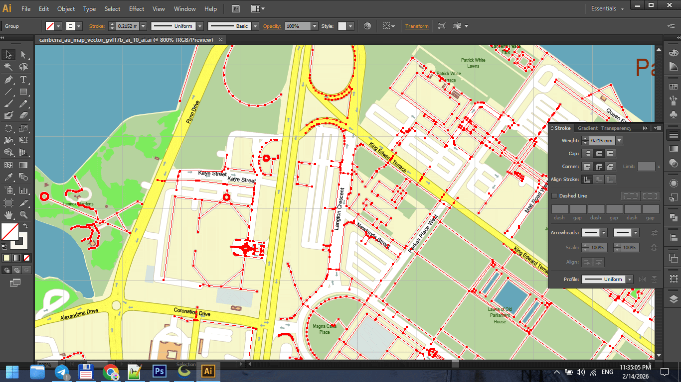
Figure 1. Stroke Weight Hierarchy in Print Maps.
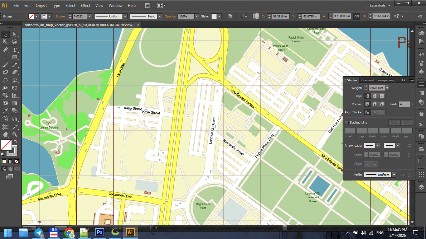
Figure 1a. Stroke Weight Hierarchy in Print Maps.
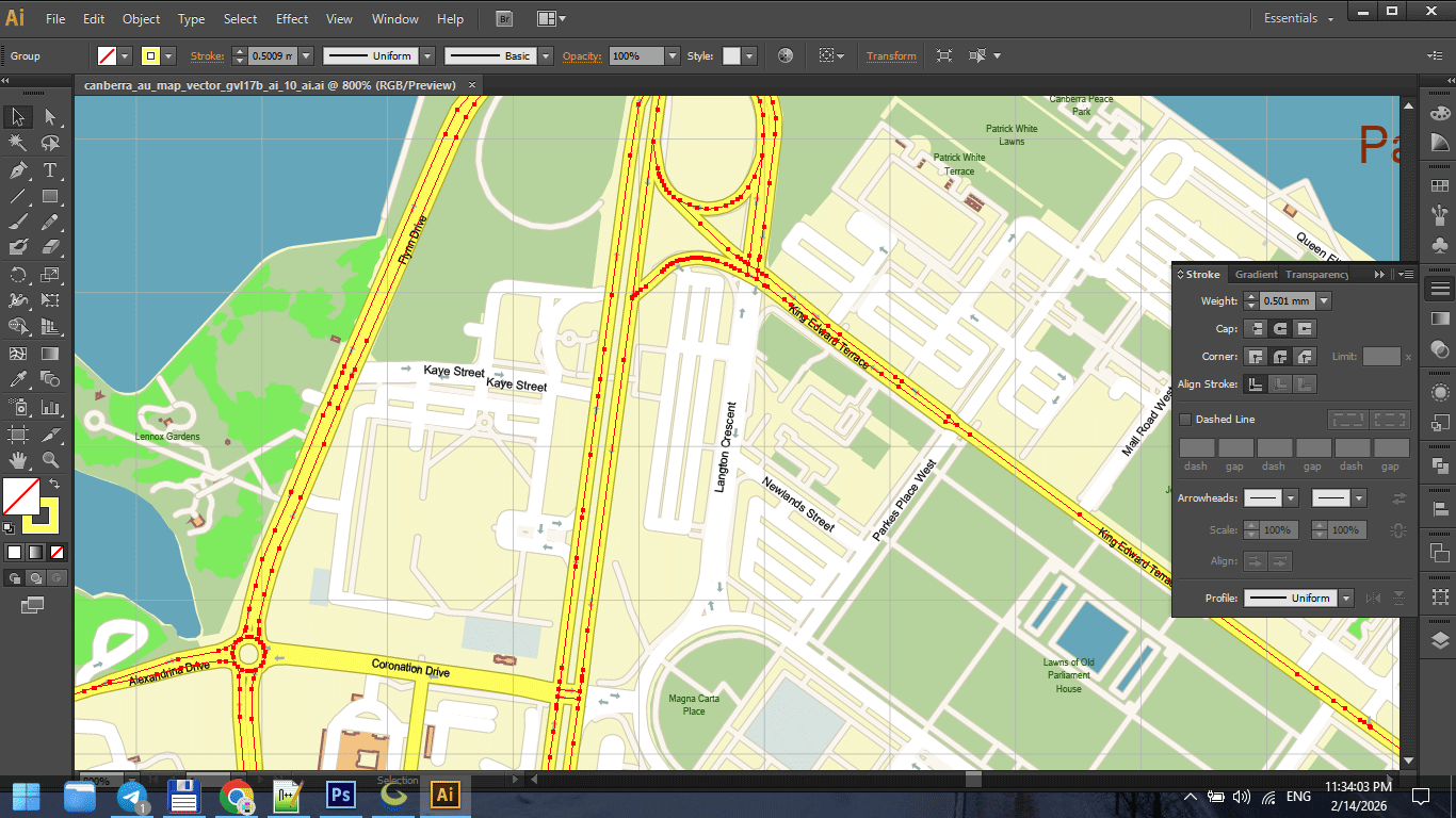
Figure 1b. Stroke Weight Hierarchy in Print Maps.
Step 3 — Typography Control
Typography is not decoration.
It is information hierarchy.
Ensure:
-
Consistent font families
-
Controlled font weights
-
Proper letter spacing
-
Avoidance of label collisions
-
Logical curvature on streets
Never overload with too many fonts.
Two or three families are usually enough.
Readability always overrides style.
Step 4 — Color Discipline
Color must support structure.
Avoid:
-
Over-saturation
-
Random palette choices
-
Strong gradients
-
Excessive contrast
For print maps:
-
Consider CMYK early
-
Avoid neon-like RGB tones
-
Keep background neutral
If colors overpower structure, reduce intensity.
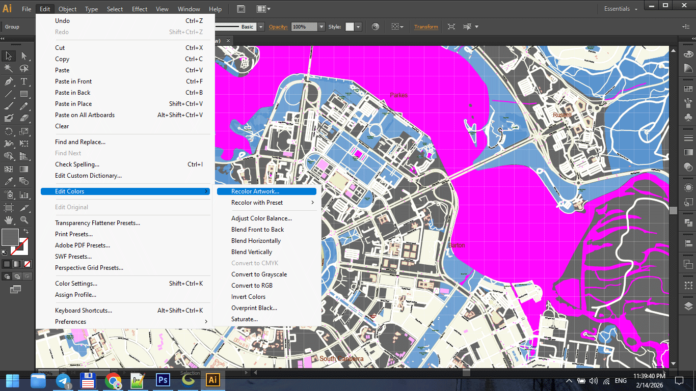
Figure 2. Cartographic Color Palette for Print.
Step 5 — Performance Optimization in Illustrator
Large vector maps can slow down Illustrator.
To improve performance:
-
Disable unnecessary effects
-
Avoid transparency unless required
-
Turn off GPU preview if unstable
-
Work with non-active layers hidden
-
Save frequently
Sometimes saving to an older AI compatibility version improves stability.
Stability is more important than modern features.
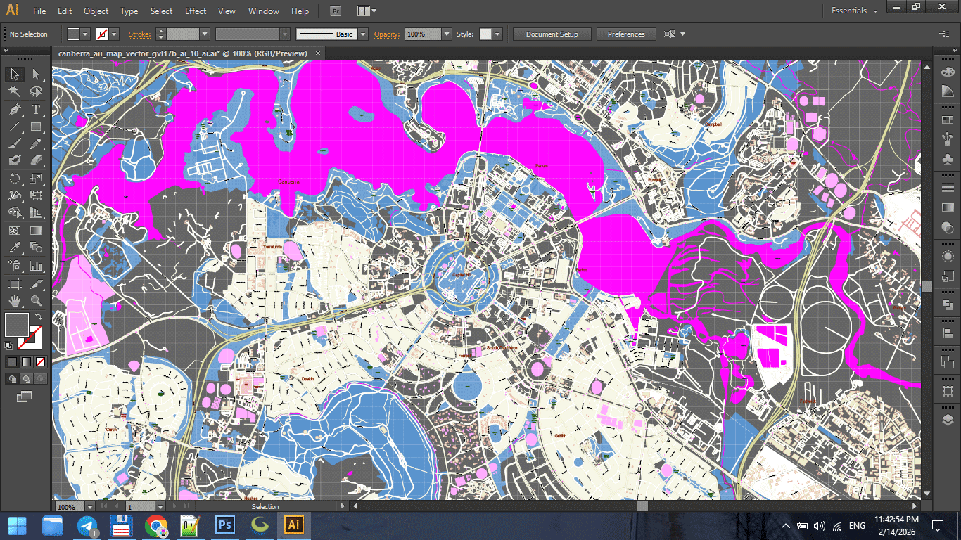
Figure 3. Print Scale Preview at 1:1.
Step 6 — Collision and Overlap Cleaning
Manual inspection is essential.
Check:
-
Overlapping labels
-
Road name collisions
-
Hidden text
-
Stroke intersections
-
Artifacts at complex junctions
Automated tools help,
but final polish requires human inspection.
This is the most time-consuming stage.
It is also what separates amateur from professional.
Step 7 — Print Scale Validation
Zooming in is misleading.
Instead:
-
View at 100% intended print size
-
Step back from screen
-
Print a small test fragment
Ask:
-
Are primary roads clear?
-
Are labels readable?
-
Is hierarchy obvious?
-
Is density balanced?
Maps are read at distance.
Design must account for that.
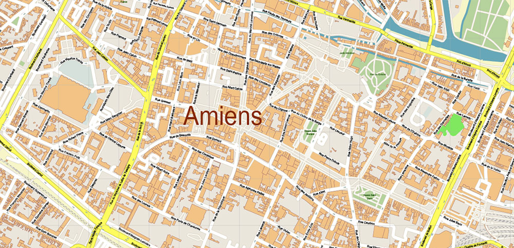
Figure 3a. Print Scale Preview at 1:1.
Step 8 — Convert Text to Outlines (Final Stage Only)
Before sending to print:
Convert text to outlines.
This prevents:
-
Font substitution
-
Missing glyph issues
-
Rendering differences
Important:
Keep a pre-outline version saved separately.
Once text is outlined, editing becomes harder.
Step 9 — Export Print-Ready PDF
Final PDF must:
-
Contain 100% vector geometry
-
Avoid unintended rasterization
-
Use correct color mode
-
Preserve stroke clarity
-
Maintain correct scaling
Check:
-
File weight
-
Zoom clarity
-
No pixelation
-
No transparency flattening artifacts
If something looks rasterized, re-check export settings.
Lighting and Real-World Conditions
Professional print maps are used:
-
On walls
-
In offices
-
In vehicles
-
In low light
Test readability under different lighting.
A map that looks good on a bright monitor
may fail on a dim wall.
Common Illustrator-Stage Mistakes
-
Styling before organizing layers
-
Overusing effects
-
Ignoring print scale
-
Forgetting CMYK conversion
-
Sending live text to print
-
Not testing at physical size
Design discipline matters.
Final Quality Checklist
Before final export:
-
CRS was correct from the beginning
-
Topology cleaned
-
Generalization applied
-
Stroke hierarchy consistent
-
Typography readable
-
No label collisions
-
Color palette controlled
-
Text converted to outlines
-
Test print approved
If all conditions are met,
your map is production-ready.
Summary
Illustrator is not where data begins.
It is where structure becomes clarity.
Professional map preparation requires:
-
Layer discipline
-
Stroke control
-
Typography precision
-
Performance awareness
-
Print validation
The difference between a decorative map
and a professional cartographic product
is refinement.
And refinement happens here.
Next Chapter
Before closing the guide,
we will review the most common beginner mistakes
that quietly ruin map projects.
→ Chapter 10 — Common Mistakes in Vector Map Production
Go to Start Page: Technology of Vector Map Production
Frequently Asked Questions
Why does Illustrator slow down with large maps?
Large vector maps contain millions of nodes. Optimization and layer control are necessary.
When should text be converted to outlines?
Only at the final stage before sending to print.
Why is print testing necessary?
Screen previews do not accurately represent physical print conditions.
Should I work in RGB or CMYK?
For print production, CMYK is typically required.
Table of contents
Chapter 1 — What Is a Vector Map?
Chapter 2 — Obtaining and Preparing Geodata (SHP, OSM, GeoJSON)
Chapter 3 — Street Network as a Graph (Nodes and Edges Explained)
Chapter 4 — Cartographic Layer Hierarchy and Visual Structure
Chapter 5 — Map Projections and Why Distortion Is Inevitable
Chapter 6 — Map Generalization and Scale Control
Chapter 7 — Vector Formats: SHP, GeoJSON, AI and PDF
Chapter 8 — Professional Map Production Workflow
Chapter 9 — Preparing a Vector Map for Print in Illustrator
Chapter 10 — Common Mistakes in Vector Map Production
 Author: Kirill Shrayber, Ph.D. FRGS