Common Mistakes in Vector Map Production
What Quietly Ruins Map Projects — and How to Avoid It
Most map projects do not fail dramatically.
They fail quietly.
-
A slightly wrong projection.
-
A broken road intersection.
-
Overloaded detail.
-
Weak hierarchy.
-
No print test.
Each mistake alone seems minor.
Together they destroy clarity.
This chapter summarizes the most common production errors — especially among advanced beginners.
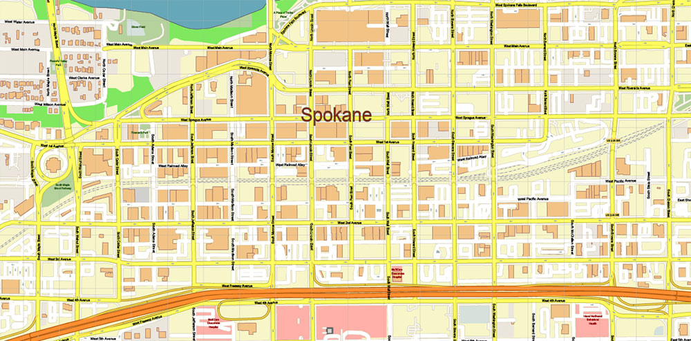
Figure 1. Printable Version – Spokane Washington US Map Vector High Detailed Street Map editable Adobe Illustrator in layers
1. Mixing Coordinate Systems
This is one of the most dangerous mistakes.
Symptoms:
-
Roads do not align perfectly
-
Buildings appear shifted
-
Boundaries slightly offset
-
Labels look misplaced
Cause:
Working with layers in different CRS.
Solution:
-
Choose projection at the beginning
-
Reproject all datasets
-
Verify alignment before editing
Projection errors are subtle — until they become catastrophic.
2. Skipping Topology Cleaning
Raw data always contains structural problems.
If you skip topology cleaning:
-
Polygons fail during export
-
Intersections misbehave
-
Simplification breaks geometry
-
Printing reveals artifacts
Cleaning topology is not optional.
It is foundational.
3. Overloading Detail
Beginners often think:
“More detail = better map.”
It is the opposite.
Too much detail creates:
-
Visual noise
-
Heavy files
-
Slow Illustrator performance
-
Unreadable print
Professional maps remove information strategically.
Clarity beats density.
4. Over-Generalization
The opposite mistake.
Too much simplification:
-
Destroys coastline identity
-
Removes small but important rivers
-
Flattens natural curves
-
Makes cities look artificial
Generalization must preserve recognizability.
If geography no longer feels authentic — you simplified too much.
5. Weak Layer Hierarchy
Without clear hierarchy:
-
Major roads do not stand out
-
Parks dominate structure
-
Buildings overpower streets
-
Labels compete with geometry
Hierarchy must be intentional.
If everything screams, nothing is heard.
6. Poor Typography
Common problems:
-
Too many fonts
-
Inconsistent sizes
-
Overlapping labels
-
Excessive curvature
-
Decorative overuse
Typography is functional.
If labels are hard to read, the map fails.
7. Designing Inside GIS
GIS tools are excellent for structure.
They are not ideal for:
-
Advanced typography
-
Fine stroke control
-
Large-format print finishing
Trying to finish everything in GIS usually produces mediocre results.
Structure in GIS.
Refinement in Illustrator.
8. Ignoring Performance Discipline
Large vector maps can reach:
-
Millions of nodes
-
Hundreds of megabytes
Without discipline:
-
Illustrator crashes
-
Export fails
-
Revisions become painful
Remove unnecessary vertices.
Control layers.
Avoid excessive effects.
Performance is part of professionalism.
9. No Test Print
This mistake is surprisingly common.
Maps approved on screen
may fail on paper.
Always:
-
Print a fragment at 100% scale
-
Check under real lighting
-
Step back and evaluate readability
A map exists in physical space.
Test it there.
10. No Version Control
Overwriting files leads to:
-
Lost work
-
No rollback
-
Panic during revisions
Professional workflow always keeps stages:
-
raw
-
cleaned
-
generalized
-
designed
-
print-ready
Never overwrite your master.
11. Designing for Yourself, Not the Reader
This is subtle but critical.
Ask:
-
Is the map readable for someone unfamiliar with the city?
-
Is hierarchy obvious?
-
Is color meaningful?
-
Is the structure intuitive?
Cartography is communication.
The reader matters more than your preferences.
What Separates Amateur from Professional
Amateur workflow:
Import → Style → Export.
Professional workflow:
Import → Clean → Structure → Validate → Simplify → Design → Test → Finalize.
The difference is discipline.
Not talent.
Not software.
Discipline.
Final Professional Reminder
A map is not:
-
Decoration
-
Illustration
-
Background image
A map is:
-
A spatial model
-
A communication tool
-
A decision-making instrument
Every mistake reduces clarity.
Every refinement increases value.
Final Summary of the Guide
Professional vector map production requires:
-
Clean data
-
Correct projection
-
Stable topology
-
Controlled generalization
-
Clear hierarchy
-
Strong typography
-
Disciplined workflow
-
Physical print validation
When all these elements work together,
geography becomes readable.
That is professional cartography.
End of Guide
You now have a complete structured production methodology
for creating professional vector maps for print.
The difference between random output
and engineered cartography
is process.
And now you have one.
Go to Start Page: Technology of Vector Map Production
Frequently Asked Questions
What is the most common mistake in map production?
Skipping structural cleanup and relying on styling alone.
Why do maps fail at the final stage?
Because projection, topology, or generalization errors were ignored early.
Is more detail always better?
No. Excess detail reduces readability.
What separates professional from amateur cartography?
Structured workflow discipline.
Table of contents
Chapter 1 — What Is a Vector Map?
Chapter 2 — Obtaining and Preparing Geodata (SHP, OSM, GeoJSON)
Chapter 3 — Street Network as a Graph (Nodes and Edges Explained)
Chapter 4 — Cartographic Layer Hierarchy and Visual Structure
Chapter 5 — Map Projections and Why Distortion Is Inevitable
Chapter 6 — Map Generalization and Scale Control
Chapter 7 — Vector Formats: SHP, GeoJSON, AI and PDF
Chapter 8 — Professional Map Production Workflow
Chapter 9 — Preparing a Vector Map for Print in Illustrator
Chapter 10 — Common Mistakes in Vector Map Production
 Author: Kirill Shrayber, Ph.D. FRGS